Brief:
Through a process of collection and categorisation of content specific to your own research theme, you are required to focus on information graphics. How can you translate facts, figures and statistics into clear and understandable visuals?
Using your research theme, explore information graphics through one of the following outcomes:
PRODUCT AND PUBLICATION
PRODUCT AND PACKAGING
PRODUCT AND DISTRIBUTION
Your resolution should reflect your own practical and conceptual interests (derived from your given research theme) within the field of contemporary graphic design.
Looking back at the cull of research I had previously collected, I was inspired by the message in which I found in the video concerning preserving native American language.
I decided that my proposal would be to create a publication that would encourage teenagers of secondary school age, 11-16 to become more involved with and celebrate their heritage, Not only would the publication promote Native American culture, It would also inform/ educate its demographic readers on the history of their culture- A reason to take pride, and also show them how little percent of Native Americans are involved in their own culture. I will then also design a box which I will use to distribute the leaflet to schools.
In my previous research I had distinguished the 3 most concentrated states populated by Native americans. I Decided that I would send this publication to high schools throughout these three states giving a definitive mailing list of 6, 2 from each state. I would send this publication to teenagers, as adults find it much more difficult to pick up languages, whereas younger children are not able to learn at the rate that high school students may be able to learn at. This publication would not only act as an indicator for those descendant of Native American culture but act as a universal signifier which would remind people of all cultures to pursue their heritage.
The 6 example addresses are shown below, I have chosen example schools where there is a Native American specialist school in the same area:
Oklahoma:
Tahlequah Middle school
871 Pendleton
Tahlequah, OKLAHOMA, 74464
U.s.a
Tahlequah High school
591 Pendelton
Tahlequah, OKLAHOMA 74464
U.s.a
I have also chosen these sister schools as they hold Cherokee events. Cherokee are one of the main Native American Tribes and it is these Cherokee indians whose ancestors travelled across the trail of tears seen in my research.
California:
La Sierra Highschool
4145 La Sierra Avenue
Riverside, California, United States
Ramona High school
7675 Magnolia Avenue
Riverside, California, 92504
United States
Arizona:
Desert Mountain High School12575 E. Via Linda
Scottsdale, Arizona 85259
United States
Red Mesa High School
Teec Nos Pos,
Arizona, 86514
United States
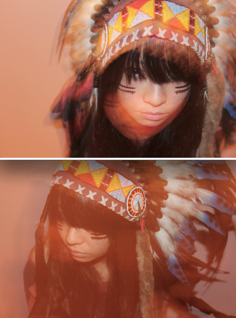
When coming up with an initial design I began to focus upon Native American symbols, A popular symbol is the Native American head dress. I have previously seen many photos in which models, or people in general are seen using the head dress as a fashion accessory.


.png)
I wanted to address the fact that much too frequently people bypass images such as these and never really notice the cultural references involved, solely focusing on the surface of the image.
This contrasted with an image such as this one of Chief Joseph:

Chiefs are usually found wearing the feathers found on these head dresses, white feathers with black tips. The label of a chief is usually one presented to a person of honour.
'An elder, considered to be the most wise, just and effective leader would rise to the rank of chief. Native American chiefs have accomplished some of the most important feats in recorded history. They have led entire civilizations, driven out enemy occupiers and led their people to lands where the hunting was good and the ground fertile.' Quote.
I began to come up with a simple design on layout paper, in which I could communicate these comparisons. I came up with a simple idea in which the comparisons had their own sections and were connected via a corsatina fold layout. I would then create a further section which would present its readers with a reminder of when Native American day is giving those a monumental day to celebrate their heritage. I then thought of adding a last section which would act as an info graphic, educating those who didn't know and encouraging both to learn and involve themselves more with the process. However I found looking at the size of the sections, that one would not be enough for the info graphic, and so I would split this across two sections.
.JPG)

I have created a design sheet in which represents this process, selecting the information from my research which I would decided to use for the info graphic.
I also began to think of ways in which I would secure the corsatina leaflet in a solid fold tying together the front section to the back. Taking another cultural symbol, I had the idea to create a paper cutting of a dream catcher, which would be attached to a ribbon to secure the leaflet shut.
From this I moved onto creating another design sheet which would focus on the back of the corsatina leaflet.
.JPG)
I wanted to carry on the flow of photography seen on the opposite side of the leaflet, and so i decided that I would place a panorama of Native America across the back, with a title sequence recognising Native American day. I also went into further development of how the leaflet would be secured together. Instead of using a ribbon to tie the leaflet together decorated with a paper cut charm of a dream catcher, which I began to think to myself, wasn't very practical, and didn't particularly add to the design. I began to consider how I could use the ribbon to further the promotion of Native American day. I thought about what ribbons could be used for, and an idea that I came up with was a wristband. I had seen and purchased ribbon wristbands before, and from my own experience of going through teenage years I knew that others liked to wear them too, such as leeds fest and glastonbury memorabilia.
Below are the wristbands I had previously purchased and were inspired by, I wanted to embed a similar simplicity into my designs but also include some Native American reference.

I looked into the Idea of Native American Symbolism to add a Cultural twist on my wristbands. After finding a collection, shown on my second design sheet, I looked at the meaning of each symbol. The one that I found most appropriate was the Native American symbol for Butterfly, The Butterfly is used to mean Everlasting life, which I thought was quite appropriate to the idea of the need for an everlasting culture. I therefore came up with a simple design shown above on design sheet 2 and drew it up in illustrator. I have used Bebas neue as the chosen font for the design as it is the font I have used in production for the leaflet.

In order to get my design onto a piece of ribbon I first printed the design above on an A4 piece of paper, and in the location where the design printed out I stuck the ribbon over the top. As I ran the paper back through the design then printed in the same place, this time on top of the ribbon.


I then started to think about the way in which people would interact with the ribbon, How would they know it was a wristband? On the second design sheet I also came up with a solution to this.
.JPG)
I decided to create a small insert found inside the leaflet that would show readers how the ribbon should be used. I drew up this idea in illustrator, creating a simple illustration of the ribbon attached to the leaflet and a second illustration of the ribbon wrapping around someones wrist, with the simple words 'wear yours' I did not want this insert to take away from the initial design of the leaflet and so I considered printing the insert on acetate.

Looking back to the corsatina format that I had originally designed for my leaflet, I realised when I made a test piece that the shape would not work. For the corsatina format to work, two outside edges would need to meet in order for the leaflet to be tied together.

Two outside edges meeting that could be tied together.

Above is how my current format would fold and the edges would meet. The last section on the right finishes with an outisde edge. However the edge at the front is folded, so these could not be secured together by ribbon. I therefore had to think of a new layout which I decided to simplify rather like the previous photo.

Inside the leaflet the three sections that I had already designed would still occur:
They would make up the left page inside the leaflet, and the info graphic, would make up the right. I found this layout more successful as the leaflet could be secured how I had originally wanted and there was now extended space to layout the info graphic.

Looking at the design so far I noticed it was lacking in any sort of vibrancy that I picture when thinking about native american culture. Although I liked the design in black and white, I thought that adding an extra one or two accent colours would highlight this. I looked at Native american patterns to find the two most used colours.


I found from these Images that shades of red and yellow were the most common colours found in pattern, closely followed by turquoise. However, wanting to pick a maximum of two, I decided to use the two most popular.
I started the process of adding colour, taking my already existent design and adding accents in a shade of red.

I was happy with how the design looked with solely one accent colour so I decided to leave the design how it was and move on to producing the info graphic.
First of all I picked the five pieces of information I would like to put onto the info graphic from the research I had collected. I then edited some of these and worded them to best inform my audience, The 5 things I wanted to communicate were:
-The United states is home to 2.4 million Native Americans. In comparison to the rest of the population this is a very small amount at 0.9%.
-Total number of US states with American native concentration is 15.
-27% Is the percentage of American Indians and Alaska Natives alone, 5 and older who spoke a language other than English at home, compared with 20.8 percent for the nation as a whole.
-The lack in using and learning our native languages means that one day, they may become extinct. Research shows that people up to the age of 18, like yourself, pick up languages much faster than adults.
-Increase in the nation's American Indian and Alaska Native population between the 2000 Census and 2010 Census. In 1830 a large amount of the Native American population was lost, when we were made to move from our homelands to reservations in Oklahoma, on a trail called ‘The trail of tears’. Let us celebrate and remember our people in our bid to keep our culture alive.
I had found a couple of designs of info graphic previously that had inspired me:

This design in particular, would work with the design I had already developed for the left side of my leaflet. Using white text over Image. I set out to find an image that I could layer underneath my info graphic. My leaflet being longer width, than height, I looked for a Native American panorama to fill this space.

I took the image into photoshop, editing the levels, curves, saturation and adding a Gassium blur with black to darken areas of the image so that the white text would show up easily.

Although the focal points of the images are hard to view now, it reflects the subtleness that I was trying to capture in the design.
I also liked the way in which they had titled their info graphic 'I am a Hispanic American'. I was worried when creating this leaflet that there would be a visible line between the fact that I am not Native American and my Audience were. I did not want to accentuate this and so I thought this was a great way to bridge the gap and in a way not segregate myself from the project.

next I moved onto trying to create visual versions of my facts, I came up with an idea for each in illustrator.
For the first fact I was inspired by another info graphic I had seen.
- The United states is home to 2.4 million Native Americans. In comparison to the rest of the population this is a very small amount at 0.9%.

I looked back at the symbols on my design sheet to look for a symbol which I could use to represent a native American. I decided to use the same symbol I had chosen to represent the Native american chief on the opposite page, The feather. I laid these out in a box shape, similar to above, and made them all of a white outline to match the text. There were a hundred feathers all together. To represent 0.9% of this, I took one of the feathers, and highlighted 0.9% of it in the red colour I had used on the opposite page.

I moved onto designing for the second fact:
-Total number of US states with American native concentration is 15.
-Total number of US states with American native concentration is 15.
For this fact I considered making an illustration that encapsulated the map of the united states with the 15 main populates states highlighted, However looking at the size that the illustration needed to be, the illustration would not be clear and people would be unable to tell what states I was trying to highlight. I therefore decided instead that I would solely draw a white filled illustration of the united states instead.


When looking at the info graphic so far I noticed that It was taking on a column layout, similar to the opposite page, and so I decided to follow this layout when developing the rest of the layout.
I moved onto my third fact, which I debated how to illustrate:
27% Is the percentage of American Indians and Alaska Natives alone, 5 and older who spoke a language other than English at home, compared with 20.8 percent for the nation as a whole.
Here I had to try and communicate the idea of communication. I had thought about a few ideas, drawing a mouth, using a speech bubble with the fact inside, and even looking through native American symbols to see if one existed for communication, however I found nothing.
I then went back to my previous suggestions and thought about trying to visualize someone speaking the language. I went back to the idea of a mouth and a speech bubble.
I found an image of a mouth online and drew it up in illustrator.


I then drew a speech bubble next to the mouth. Picturing how to visualize Native American language, I started to think of the speech bubble filled with Native American pattern.

I moved onto the next fact. I wanted to do a simple illustration in order to balance out the above illustration. My next piece of information is:
-The lack in using and learning our native languages means that one day, they may become extinct. Research shows that people up to the age of 18, like yourself, pick up languages much faster than adults.
-The lack in using and learning our native languages means that one day, they may become extinct. Research shows that people up to the age of 18, like yourself, pick up languages much faster than adults.
I wanted to have a simple visual that would compare young adults to fully grown adults, carrying on with the coherent style I was producing above.
In order to keep the design simple I made a simple illustration using the outline of the human body, making one smaller than the other, to represent young adult and full adult, following the same colour scheme.
In order to keep the design simple I made a simple illustration using the outline of the human body, making one smaller than the other, to represent young adult and full adult, following the same colour scheme.

The design so far:

I noticed at this point that I hadn't darkened the image enough in the background and so I took the image back into photoshop and added more gaussian blur using black, to make the white text and illustration appear more readable.

I moved onto the last piece of information that I wanted to present to my readers, in this certain section, I wanted to emphasise the amount that this culture had grown since the begging out the genocide through past the native American Removal act. I wanted to initiate a remembrance to those who had been lost, and create an appreciation that today the culture is thriving.
I stuck with the remembrance theme for my illustration and focused on visualising the 'trail of tears'.

Lastly I wanted to, after focusing on remembrance to move forward and inspire these young adults to celebrate their culture, and Look back on the information that they had been given, to give them motivation to keep their culture alive.
I have used the Native american symbol for butterfly a lot across this piece of work:

The butterfly symbol is used to portray the concept of 'Everlasting life'. I therefore wanted to convey the Native American culture as one that would be everlasting, with the remembrance and involvement of the younger generations.
Celebration:

Finished info graphic design:

Next I started to work on the front cover of the leaflet, I wanted to stick with the same theme that I had used through out creating this publication. Using a black and white image, and now using some of the same symbols and typefaces I had used through out.
I found a great photograph of some dreamcatchers displayed against the red soil of what I could only presume was the backdrop of an original Native America.

I took the image into photoshop, increasing saturation, changing curves and levels and adding a black and white filter.

I also added black gaussian blur to the right hand side because I knew this is where I wanted the text to go and then cropped the image to the size of the leaflet.
I added the title 'Native American Day' as first and formost this is what I wanted to communicate.
along with the Date underneath. I wrote this in the same style as my inside sections to keep consistency.
along with the Date underneath. I wrote this in the same style as my inside sections to keep consistency.

To finish the front cover design I wanted to include some Native American symbolism. I decided to use the feather, in which I wanted to create a modern/minimalist interpretation of a native american head dress around the text. first I drew the feathers on around the text.

I did however like the way this design looked by itself and so I chose not to add any extra detail.
Not knowing a specific design I wanted to do on the back, I started to design the box in which I would send the leaflets to the schools in.
after working out the dimensions that the box would need to be, I began to draw up a few ideas as seen on this design sheet:

I was however uninspired by anything I had come up with and therefore went searching for innovative box designs online. The one box design that I really liked, I found on the website. http://www.youthedesigner.com/ It consisted of a box, which when closed would be held together by the interlocking of the side sections:

After finding this design, I drew up another couple of boxes. The sides consisted of panels covered in a Native American print that I would draw up myself in illustrator, and the interlocking section (in this picture, a type of fly) would consist of one of the native american symbols I had found in my research.
I sketched up the box design first with an interlocking Native American eagle symbol and then with the butterfly. I decided that the butterfly was more appropriate for this piece as It was a running theme that I had used throughout.

I also found that the curved panels seen on the image of the Borinot boxes would not be functional for this project as they would be travelling through the mail, and so I decided to make these sections flat instead.
I drew out the net that would create the box shape, and then drew this up in illustrator, the boxes dimensions are the result of the leaflet laying in a column of one, in two rows.
Two leaflets would be able to lay flat in the box, one above the other. The boxes height relates to the idea of the leaflet being mass produced for schools. meaning that at least 100 copies of the leaflet could fit in the box.
Two leaflets would be able to lay flat in the box, one above the other. The boxes height relates to the idea of the leaflet being mass produced for schools. meaning that at least 100 copies of the leaflet could fit in the box.


I then went into illustrator and started to design a simple native american pattern that would cover the side sections of the box. I also decided that I would incorporate the third colour, a golden yellow into the design of the box, as there would be a lack of black or a photograph as a backdrop. Using the images that I had collected earlier of Native American patterns and the symbols used throughout the project, I created the simple pattern below.

I would repeat the pattern across the side panels of the box to ensure they were covered.

I also thought that this pattern would work well on the back cover of the leaflet, as a method of consistency.

Moving on to create a address tab design, I encorporated the same patterns, symbols and fonts I had used throughout:

The finished pieces that I took into the final crit:


After the crit I was told that I had been ambitious with my designs, However the tutors seemed to be confused as to why I had created a box. Although my blog communicates the idea that the leaflet is meant for mass production and would be sent in bulk to schools, I feel that a mailing list would help any viewers to understand. I created a mailing list that identified the 6 example schools I would send the leaflet to, designed in the same style as the best of the project.

The mailing list features some wooden signs, in which point in the direction to the schools which i have listed on pieces of ribbon and made them appear to be tied around the stem of the sign. I have also drawn a stamp in the corner in the style of the native american patterns I have studied so that the pattern also appears to look like a postcard.
I was also told that It is not often that Graphic design is ever printed onto plain white card, and so I will reprint on a stock that details a more off white or grey, with a possible texture. After I had been to the craft shop for stock I had chosen to print on a champagne coloured card pictured below. After it had printed I found that I was not overly happy with the outcome. The tone of the paper, being darker than white made the mid tone reddish colour I had used seem darker and less bright. There was also a big difference in contrast between black and white due to the darker stock. The text which was once well readable on white card had now become quite unreadable due to the darker tone of the stock and the texture. If I were to be able to print again, I would make sure that the stock I was printing onto wasn't as grainy, but still keeping an off white colour, however making sure that the colours would stay vibrant when printed. or to also solve the problem I would alter the text so it was either bigger or bolder therefore more readable on this grainy paper.


Image shows difference in intensity of colour when changing from white cars to a grainy champagne card.

Image shows clear writing when printed on white card.

Image demonstrates decreased readability.
Thirdly, I found that seeing my box as a prototype I was not satisfied with how the address caption looked and so I have redesigned it in illustrator, still embodying the same themes as the rest of the project. I have used one of the same motifs which i thought was very strong and have edited it to use for this purpose.


Here is my final piece pictured below, If I were to have the time and money to print again, I would print on a less grainy, lighter stock in order to bring back the vibrancy of the colours and the readability of the text.


 \
\
No comments:
Post a Comment