Thursday 27 February 2014

OUGD505: Yankee candle publication - Box front cover design.

I had decided the concept for the front of my box which was to create a doorway scene, as if when people opened the book they were 'opening the door on Yankee candle'. I had to keep in mind the traditional aesthetic of Yankee candle and create a scene that is considerate of this. I began looking at different doorways for inspiration, as many doorways could be traditional but not in keeping with the brand. 


I loved the simplicity of this doorway, and the simple impressions on the door, placed against a traditional red brick background. However this door did seem slightly too modern for the current aesthetic of the brand, as the doorway is quite minimalist. 


I found that this doorway breathed the essence of Yankee candle, the layered impressions, and concrete framework are reminiscent of the edwardian era. However I wanted to find an edwardian door with more detail and so I began to look further. 


I found that this was a perfect representation of what I needed for the Yankee candle brand, Edwardian and traditional, the door has some detail, however is not overly individual as the image shown above, but is more general. The Backdrop also uses the traditional red brick already seen in some Yankee candle merchandise.

With an image in mind of the kind of scene I wanted to use, and the style in which I should complete this, I drew up a sketch based upon what I had found, taking the most appropriate parts of each design and adding extra details such as the candle lit lantern (Yankee candle).


The style which I need to complete this in needs to be resemble current Yankee candle style, in which gradients and authentic textures to give illustration a realistic feel. Such as that seen on the Yankee candle sweet shop and house sets.


I scanned in the illustration of the door I had done and digitally mocked up the outline of this:

I started to think about how I could make parts of the illustration look realistic, I started working with the shrubs at either sides of the door. I made two different petal shapes and layered them on top of eachother until this part of the illustration was totally covered. 


Once I had done this I selected half of the leaves and gave them a green gradient, taking the other half of the leaves I gave them the same gradient however I rotated it 180 degrees to give the piece more differentiation. Adding the gradient instead of using flat colour as I normally do when using colour, allowed the design to start to look more true, and credible to past Yankee design. 


I applie the gradients to other elements of the design such as the shrub branches and the lantern hanging above the door. On a new layer I created the title section using the fonts and colours used throughout the Yankee candle brand Book antigua and Halo hand letter. 


I used the same idea on the door layering gradients in order to create the illusion of the square shaped impressions/ imprints into the wood using a classic deep red seen throughout Yankee candle branding. I also applied this to the concrete frame surrounding the door. 

However I felt that the use of these gradients by themselves did not solely create the true to life image (textures) that the design needed in order to be recognised as part of the brand. For this reason I look into playing with textures in illustrator. 


The first section I played with was the slabs of stone underneath the door used to represent the pavement. The gradients made the stones look to perfect and so I looked into illustrator textures where I found one called grain. The grain texture made the surface of the section appear rougher and less perfect creating a more honest reflection of the object it was mimicking rather than an immaculate yet more false impression.


I went back to the lantern I had previously illustrated and looked at textures which could make the refraction of light look more realistic. I way in which I edited the piece was pixelating the background in a crystallised effect, much how light would look when passing through a multi faceted surface. 


I went back to the illustration of the shrubs I had previously done and took the same crystallisation effect and placed it upon all of the leaves. I found that adding these textures made parts of the design look less ideal, and more sincere to the object that they were representing. And once viewed altogether, would create a realistic looking representation of a scene, rather than a fanciful image.


Lastly I applied the traditional red brick texture into the background, I choose red brick over any other type such as sandstone as I thought this would suit the vernacular of the country and colour scheme more than any other. Instead of attempting to create and mimic my own red brick pattern, I sourced a brick texture from online, with a 1mm mortar gap in between each of the bricks. I wanted one that was not too clean cut (unrealistic) and not too industrial, A slightly weathered brick would match the overall brand aesthetic, much like the bricks seen on previous Yankee candle merchandise (sweet shop).

Once I had this texture I imaged traced it in to illustrator so that the appearence of the background match the rest of the design I had already Illustrated. I did this in a 16 colour image trace so that the texture would keep its natural imperfections and identity. I felt that this was a better method than drawing the pattern out brick by brick, as a natural appeareance is what I really wanted to pin down.

Below is the finished front of the box:   


Monday 24 February 2014

OUGD505: Yankee candle publication - Page size and box net.

In terms of ratios, I wanted to keep the same shape of the book inspired products currently distributed by Yankee candle, but scale it down to be more appropriate for my amount of content. 


The box shown above is of portrait format and slightly bigger than A4. This box is much too large for the amount of content I have and therefore I think it would be more appropriate to scale the size down to A5, however keeping the classic portrait shape. 


Inside pages size:


I could then work out how big the cover would be as I am planning to case bind the book. I need to leave a 3mm overlap on each edge so that the pages do not peek through the outside edges of the front and back cover. 

Case bind dimensions:
This then gave me enough information so that I could start create a true to size net for my box and begin designing. I decided to create the tray inside the box which would hold the book to be 3mm bigger on all edges to ensure that if the book bind was to take up more room, the book would still fit comfortably inside the tray.  

Tray base dimensions:


Box base dimensions:


For the spine (depth) of the box I am not able to give an exact measurement, as I am not sure how thick the book will be until it has been produced. As I am not able to calculate the depth of all my pages plus the case bind. For this reason I decided to create a depth of spine that would be aesthetically appropriate for the a5 format (box is slightly larger) which was a 30mm depth. 


I know that looking at 30mm this depth is much larger than the spine of the book will be, however I can rectify this by making a shallow cuboid to place in the bottom of the tray so that the depth of the book + cuboid = depth of the tray.

Below is the front and back cover as well as the spine (depth of the box) that I have to play with for the design.


Thursday 20 February 2014

OUGD503: Responsive - Studio brief 2: Collaborative brief / Bear cereal : Idea generation.

Collaborative Brief. 
Bear Cereal.


Progress catch up/ Idea generation session.


Today me and Caitlin met up to discuss our progress with one another. 


I shared with Caitlin the image of the bear I had started to produce which could take part of the series of cut out letters that would be included on the back of the box. She was very happy with the style and execution of the piece I had done. 


Caitlin then showed me some sketches she had done, completing a similar process to me in which she took letters, and applied an animal to each of the letter shapes. Caitlin was very strong at manipulating the shape of an animal to fit the curves etc of a letter and therefore we decided that Caitlin would make the structure for each of the letters, and I would digitally produce them in a consistent style afterwards. 


We then came together and decided to start afresh brainstorming activities for the back of the box, in order to get our creative juices flowing we decided to started to pick an animal for each letter (we picked 5 with an aim to collaboratively create 5 box backs) however, we researched a couple of other animals just incase we had time to produce more at the end. We wanted to choose animals that children would already know about such as a bear and an elephant, and introduce them to knew ones as a matter of learning, such as a Gecko, or Chameleon, further improving their knowledge.  


We found facts for each of the animals, as the boxes for the cereal are currently very facts based. We thought that pulling out facts would provide us with some kind of a base which we could create activities. 


The facts we found are shown below: 


Elephant:


• Elephants are the largest land animals in the world.


The brain is 3 or 4 times larger than that of humans although smaller as a proportion of body weight.


• Elephants purr like cats do, as a means of communication.
• The elephant trunk has more than 40,000 muscles in it.
• Elephants have greeting ceremonies when a friend that has been away for some time returns to the group.
• Elephants prefer one tusk over the other, just as people are either left or right-handed.

Source


Octopus:


  • Octopuses have three hearts. Two pump blood through each of the two gills, while the third pumps blood through the body.
  • If all else fails, an octopus can lose an arm to escape a predator's grasp and re-grow it later with no permanent damage.
  • They have been found to play with a ‘toy’ and to have individual responses and individual temperaments.

The areas around the eyes, suckers, arms, and web may darken so the octopus appears more threatening.

-In early spring, octopuses move closer to the shore to mate. Two months after mating, the female releases 100,000-500,000 eggs. 

- There are 300 different species of octopus, all are venemous, but only one is deadly. 


Gecko's:

- Geckos are reptiles and are found on all the continents except Antarctica. These colorful lizards have adapted to habitats from rain forests, to deserts, to cold mountain slopes.

- Geckos are also able to shed their tails if a predator grabs them. The gecko runs off leaving its twitching tail behind.

- Most geckos make noises such as chirping, barking, and clicking when they are defending their territory or attracting a mate.

-Most geckos don’t have movable eyelids and instead have one transparent eyelid which they keep clean by licking it with their tongues.

- There are over 1,000 species of geckos. 


Chameleon.

- http://www.youtube.com/watch?v=KMT1FLzEn9I

1. Almost half of the world’s chameleon species live on the island of Madagascar, with 59 different species existing nowhere outside of the island. There are approximately 160 species of chameleon. They range from Africa to southern Europe, and across south Asia to Sri Lanka. They have also been introduced into the United States in places such as Hawaii, California and Florida.

2. Colour Changing. Most chameleons change from brown to green and back, but some can turn almost any colour. A change can occur in as little as 20 seconds. Chameleons are born with special cells that have a colour or pigment in them. These cells lie in layers under the chameleon’s outer skin. They are called chromatophores. The top layers of chromatophores have red or yellow pigment. The lower layers have blue or white pigment. When these pigment cells change, the chameleon’s skin colour changes.
Chromatophores change because they get a message from the brain. The message tells the cells to enlarge or to shrink. These actions cause cell pigments to mix—just like paint. A chemical called melanin also helps chameleons turn colour. Melanin fibers can spread like spiderwebs through layers of pigment cells and their presence causes skin to darken.
Many people think chameleons change colour to blend in with their surroundings. 

3. Chameleon eyes have a 360-degree arc of vision and can see two directions at once.

4. Chameleons vary greatly in size and body structure, with maximum total length varying from 15 millimetres (0.6 in) in male Brookesia micra (one of the world’s smallest reptiles) to 68.5 centimetres (30 in) in the male Furcifer oustaleti.

- They have Ballistic tongues that are 1.5-2 times the length of their body.

Owls:
  • Owls are active at night (nocturnal)
  • Owls can turn their heads as much as 270 degrees.
An owl has three eyelids: one for blinking, one for sleeping and one for keeping the eye clean and healthy.


Not all owls hoot, and owls can make a wide range of other sounds, such as screeches, whistles, barks and hisses. During the nesting season, owl calls can often be heard up to a mile away. 

  1. A group of owls is called a parliament, wisdom or study. Baby owls are called owlets. 


Bear:

Grizzly bears have a better sense of smell than a hound dog and can detect food from miles away.

Top speed 35 mph.

Today, there are an estimated 1,800 grizzly bears remaining in five populations in the lower 48 states. Most of these bears are located in the Northern Continental Divide Population (including Glacier National Park) and the Yellowstone Population. Alaska is home to a healthy grizzly (sometimes called brown bear) population. 

Grizzly bears need to eat a lot in the summer and fall in order to build up sufficient fat reserves to survive the winter denning period.


Dramatic gatherings of grizzly bears can be seen at prime Alaskan fishing spots when the salmon run upstream for summer spawning. In this season, dozens of bears may gather to feast on the fish, craving fats that will sustain them through the long winter ahead.


Jellyfish:

  • Some can be very hard to see, nearly invisible to the human eye.
  • A group of jellyfish is called a ‘bloom’, ‘swarm’ or ‘smack’.
  • Large blooms can feature over 100000 jellyfish.
  • Jellyfish don’t have brains.

... some jellyfish are bigger than a human and others are as small as a pinhead?
... that jellyfish have been on Earth for millions of years, even before dinosaurs?

Source


Development:

Once we had all the facts together we came up with the structure to have 2 activities on the back of the pack and the construction of the animal letter. 


We wanted one of the activities to be individually for the child, and Caitlin thought of the second activity in which the parents could be included aswell. 


The first activity would be an interactive game such as spot the difference, colouring in etc which would have a link with the facts about the facts of each animal. Whilst the second activity would be a card inside the box, with a set of questions relating to the facts on the box, as the child reads over the box for the week, the parent/guardian can then ask the child questions about what they have learnt. Science shows that children learn better when interacting with others and working within a team.


'Children’s choices and interests are the driving force for building knowledge, skills and understanding: by working and playing with other people, they are constantly learning about themselves and their social and cultural worlds.'

'Neuroscientists study how the human brain develops and functions, and how human minds are 
formed. Their research shows that children are highly motivated, intelligent learners, who actively 
seek interactions with the people around them – from the earliest gaze of infants towards their 
caregivers, to the confident child who asks ‘Will you come and play with me?’ Children have ‘built-in’ 
exploratory tendencies, and engage all their senses to investigate and master tools and resources, 
to develop their skills, and to build their knowledge and understanding of the world.'

Source


The list of interactive activities that we came up with for each animal are as follows:


Chameleon (C) 


 A colouring in task, playing upon the idea that Chameleons change colour in order to camoflage themselves. 

'Colour Changing. Most chameleons change from brown to green and back, but some can turn almost any colour. A change can occur in as little as 20 seconds. Chameleons are born with special cells that have a colour or pigment in them.'
An outline with white fill illustration of a chameleon against a vibrant jungle background (luscious green trees, bright exotic flowers). Children are asked to colour the chameleon in and help him hide from his predator. ( A money swinging in the trees in the background. 


Elephant (E) 


A problem solving task based upon the aspects of elephant social gatherings. 


• Elephants have greeting ceremonies when a friend that has been away for some time returns to the group.


A maze, in which the middle is a social gathering, there are 2/3 openings to the maze in which there are elephants, who want to find their way to the social gathering. 'Help us find our way to the party, we've missed our friend and want to say hello.'

Jellyfish (J)


A spot the object game, based upon the idea that some jellyfish are almost undetectable to the human eye. 

  • Some can be very hard to see, nearly invisible to the human eye.
An ocean scene filled with different types of fish, mammals, coral, reefs, rocks etc, and children are asked if they can spot all the jellyfish. 


Bear (B)

A select the right object game, also a problem solving task, based upon the idea of brown bears enjoying eating salmon. 

Dramatic gatherings of grizzly bears can be seen at prime Alaskan fishing spots when the salmon run upstream for summer spawning.

The idea I came up with was to have a selection of fish rods 4/5, with items attatched to the end, an old boot, seaweed, fishing net and 2 salmon. The fishing wires have become muddled up. Ask the children to find which fishing ropes have the salmon attached to the end.

Owl (O)


Quick and fun activity based upon the fact that owls are nocturnal, and come out at night time.


  • Owls are active at night (nocturnal)
Print the owls onto the box in glow in the dark and heat sensitive screen printing ink. Ask the children to turn off the lights and rub the box to make the owls come out.


Sunday 16 February 2014

OUGD503 RESPONSIVE: Studio Brief 1/ Yoga teacher logo.

I decided for my 4th brief, I wanted to reapproach a design contest again. This time I went to look at 99 designs. I had a look at the different competition catergories and one stood out to me in particular 'Logo and identity'. in the past I have found coming up with logos a particularly hard thing to do, as they are so distinct and personalized. However I saw this as an oppurtunity to improve both my ability and efficiency as designing a logo. 
I also chose this brief due to the time frame. When I first looked at the contest entry, the time specified that there was only 3 days and 16 hours. This is the shortest brief I have ever worked with, and as the brief requires an online submission by a certain time, allows no ability to be late or rearrange the deadline. 

The Brief:

'Create a winning design for a newly certified Yoga Teacher.'


I took a look at the specifications set out by the client. 

The name that they wanted to incorporate into the logo was 'Yoga by Tasha Rae'.


Sample Logos the client uploaded which they thought could inspire a design:


The client included some extra information which would influence the design:


She wants the design to lean more towards inviting a feminine based audience as a pose to a masculine one. There is a 50/50 balance requested for both the young and mature scale, meaning she wants the design to draw in both ages, and be in the middle of Economical and Luxury. The client would prefer the logo to be much more classic than modern, however with the cleanliness and simplicity that the client wants I think the design could also result in appearing quite modern. There is also a 50/50 preference for playful/seriousness, Loud/ quiet and subtle/obvious. Due to this I don't want to be overly gimmicky with including too many yoga motifs, but try to keep this more subtle. 

The colours preffered to be used are stated as black, grey and pink. However, I feel that these colours don't particularly encompass a vision of yoga. They seem, very strong, assertive, and quite edgy. Whereas yoga is very calming, balanced and relaxed, and therefore this particular element to the brief leads me to want to submit two copies of the logo, one in the specified colours, and one in colours I would find more appropriate. 

The logo is going to be used online, on a website, in online advertisements. 

Extra notes that the client added was that she wanted the logo to be classic, like it will be used forever. The client also gave a slight piece of information of context of the logo stating that photographs on the website will be in black and grey.


My first port of call was to look at logos for other Yoga teachers/ Yoga houses, I started to build a collection of the ones that I found most interesting:


This piece was one of my favourite I had found, It was its brightness, simplicity and subtleness that struck me. The colours seem to convey something bright, happy and soothing, whilst the blend of the two typefaces used dream up ideas of culture and the buddhist spirit in which yoga draws from. 


        This piece also devised great visions of relaxation, vitality and a journey through the personalised text which invites our eyes to wonder. The colours used also arise an image of joy, vitality and life.


This logo is much more calm due to the use of an earthy green, a natural and organic colour. However this logo does not appear organic, due to the mechanised illustration, however it does seem quiet, tranquil and low key.


The next piece I felt was slightly more classic, with a more formal illustrative style and colour choice. The logo also has a more rigid font choice with extra decoration in the form of some personalised serifs.


This piece I had found was one of my favourite, due to the spirituality that spilled from the logo. The art noveau type seemed very organic, much like style that yoga is. The logo also makes an emphasis on the idea of light, A very great symbol in the buddhist religion. 


I was fond of the next logo due to its ability to be subtly playful. I enjoy the way in which the designer has taken the classic lotus flower emblem associated with logo and played with negative space in order to create a direct reflection of the text with illustration.


The last image I found reminded me how it can pay off to be simplistic, and that sometimes the simplest ideas are the most appropriate. The designer has chosen a simple typeface, and then created one vector line, and repeated this 4 times in order to create an outline pattern.


I started drawing up an idea, which was rather influenced by the first logo I had seen. After looking at the other entries to the competition, I really wanted to enhance the sense of simplicity. I also wanted to emphasise how a much more minimalist design, could be much longer lasting than other more decorative options. 


Another element that I didn't like about many of the other entries was that I felt they already looked dated. this is especially obvious in the first two designs. Gradients used in this manner are ressemblent of those seen in the early 2000's graphic design. The out dated look is also helped especially in the 2nd image through the use of a very ornate font, used for too much text. The client wanted the design to be classic, so that it would not need to be changed for a long time, I do however feel that some of the entries looked in terms of that they would need to be changed before they were even used. 

first logo:


I noticed when looking at other designs that the Lotus flower was a very prominent motif. 


The meaning of the lotus flower:

'It emerges from the lowest point of the muddy swamp, growing from the mud at the bottom of ponds and streams; the superb Lotus flower rises above the water and is usually white or pink with 15 or more oval, spreading petals, and a peculiar, flat seedcase at its centre.'

'The Lotus flower essentially represents the clarity of heart as well as the mind. It also represents strength, good luck, long life as well as honour and respect.'

'It turns out the symbol of the lotus flower, or lily, has been a spiritual symbol in Eastern religion for thousands of years. The lotus flower grows from the bottom of streams and muddy ponds to rise above the water and bloom. It symbolically represents being fully grounded in earth, yet aspiring towards the divine. At night, the lotus flower closes, and sinks below the water, just to resurface again untouched the next day. The lotus flower is an iconic symbolism of beauty because it lives in the muddy water yet remains unsoiled.'

With such a monumental meaning, and its great links with the lotus pose within yoga, I decided that working with the lotus flower would be a great place to begin. 

Using both the petals of the lotus flower and the structure seen in the yoga bhoga logo (pattern around the negative space of a circle) I drew up a first motif. 

Although I liked this idea, I thought that the shape of the petals were too generic, I wanted to inject personality and more so some culture (Yoga originates from Buddhism) into the design giving it a more ethnic look. I did this by making some simple changes to the shape of the petals. 

However, with the new changes made, I felt that the ratio of the size of the petals to the inside circle which would hold the information subscribed by the client (Yoga with Tasha Rae) was wrong. The size of the petals would need to be smaller. so that when sized down the information inside the logo would not be compromised. 


I drew up the same structure again, however this time making the petals about half of the size, not only was the new design more realistic, but scaling the petals down also made the design look furthermore culturally rooted. 

Once I was happy with the shape, I drew this up digitally in illustrator. 


I felt that the simple line work was reminiscent of the simplicity and minimalism I was previously talking about.

I then started to work with the information that would be placed inside the circle.
(Yoga with Tasha Rae). I wanted to break up this information by doing it in two different fonts. The first section 'Yoga with' I decided to do in a very oriental font. 


The use of a more ornate font, against the minimalist line work would enhances and brings the to design the roots of yoga. 
For the second section I wanted to choose a font that would be complementary to the ethnic font I had already chosen to use. After trying out both a serif and a sans serif font I decided that the serif matched more appropriately.


After I had added the text as prescribed by the client, I felt that there was too much negative space within the circle, and so went back to the motif of the lotus flower. I drew up a small lotus flower in illustrator and placed this above and below the written information. 


However the design felt too busy and so I tried it using only one lotus flower. 


I was happy with this design, I felt it responded well to the simplicity and modern aesthetic requested by the client. However it still latched onto the roots of yoga, implementing the use of the lotus symbol and the use of an oriental themed type. I didn't particularly agree with the colours prescribed by the client and so I tried to manipulate the colours asked for to suit the purpose of the branding more. 

The colours that the client asked for were Black, pink and grey. As far as colour pallets go I would normally associate yoga with more organic colours as it is all about mind body and soul, however this is completely opposite to what the client is requesting and so I tried to work with her colour pallet. 

I finished the logo in three colour ways. The first I submitted was the one I thought would be most appropriate, solely black and white. I felt that the black and white made the logo appear less gaudy and somewhat materialistic and too feminine. Inside I felt that the combination of two colours made the logo look calming, classic and simplistic as well as modern, through the use of a monochromatic colour scheme. 


However The client eliminated this design straight away as I had not included all the colours she had requested for the colour scheme. And so I produced the logo two more times using colours which I thought the client would prefer.


I created the logo in a mix of white, black and two shades of pink, I felt that this was a good compromise between what the client wanted for the brief and what I thought was best. The client seemed to prefer this design to the last and kept it within the competition and open for votes.


The last design I submitted was my least favourite it used solely black and pink as a colour scheme. i felt that when the pink was added in and used by itself, that it cheapened the logo and actually took away from the timeless aesthetic that the client was searching for. The client appreciated this logo more than the other two which made me realise that we both had two entirely different visuals in mind. Unfortunately I didn't advance in the competition and the client picked a different logo as the winner.
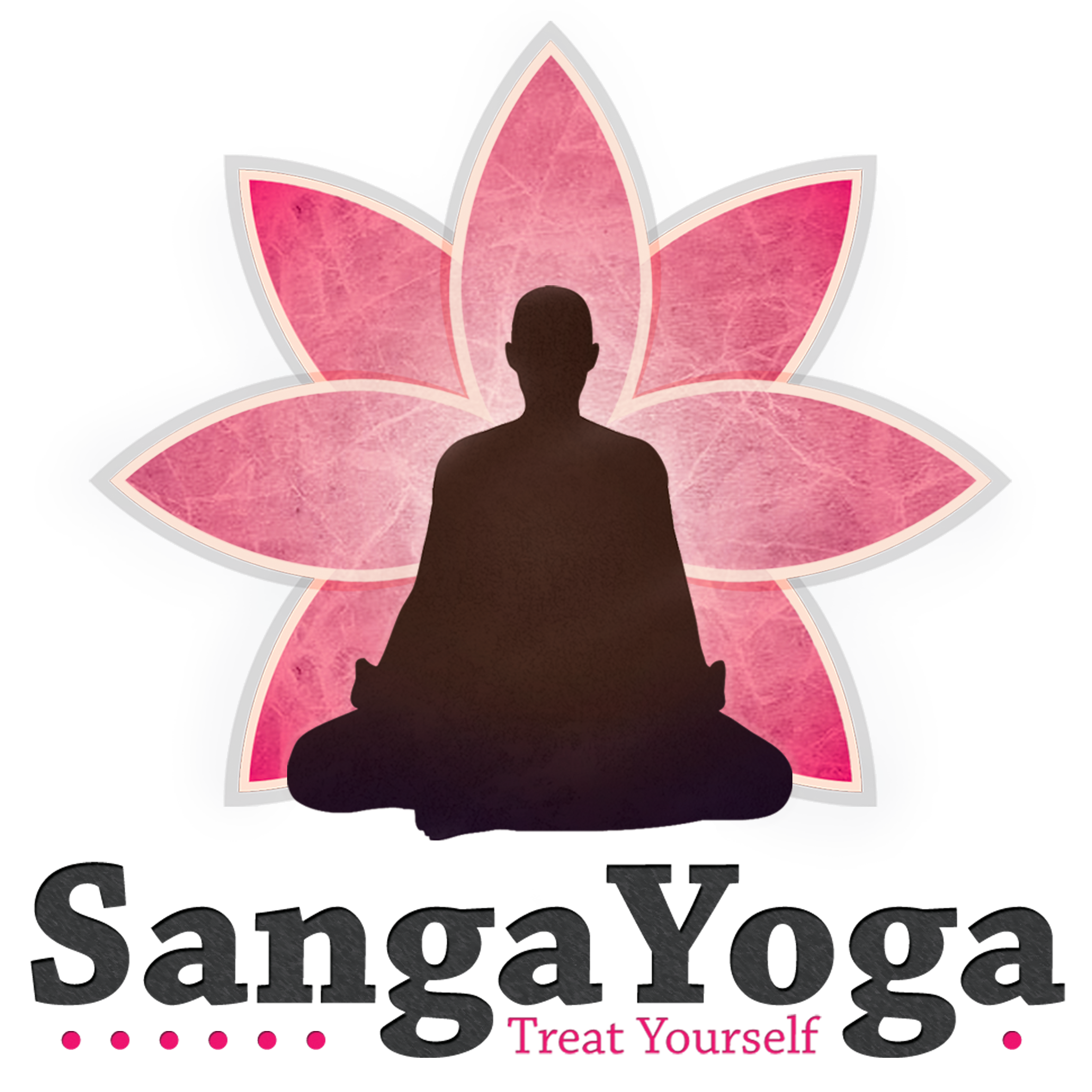
Winning design:


I wish that I could have had the oppurtunity to communicate with the client and work more with her wants and enlighten her on why I made certain descisions. However, I also realised whilst completing this brief that I shouldn't worry too much about the situation, as when working with clients in the future, I will always be in good communication and contact with them. However It was a valuable experience in having someone judge your designs without you being able to explain yourself, as this is much what it is like when people see your designs out in public.