Collaborative brief.
The brief:

The Creative Challenge
We want you to bring the alphabet to life on the back of our Alphabites boxes. We hope this will appeal to graphic designers and illustrators,
but how you approach this is up to you. You might continue the idea of celebrating and editorialising ‘one letter per box’ or you might have ideas that bring in one or more letters at a time. What will the back of yourbox/boxes look like? How will the content inspire and engage kids? How will you build excitement among kids, and anticipation for future boxes. Will boxes look the same stylistically or will you propose variation from one box to the next?
You might want to focus on helping us do what we’re already doing
better, or taking a step back and looking at the Alphabet creatively from
a different viewpoint.
I began looking into alphabet activities for children that helped them to learn, interact and engage with the alphabet, for example:
If the pack was focusing on the letter 'B' have a selection of illustrations as one of the activities and ask the users (children) to colour in the illustrations that are representative of beginning with the letter 'B', for example:
colouring in the bear.
colouring in the boat.
I thought that this would be quite a good activity for children to learn letters of the alphabet, and associations of these, much like in the roles of semiotics, without the activity feeling too instructional and educational. The activity would allow the children to be educated, but it also opens the window of creativity and is quite a craft based activity.
A classic game is word search, A simple educational task, Children could then be asked to find the words which they have coloured in, in the word search.
Applying words to the images they have identified starting with the letter B adds a new dimension to learning.
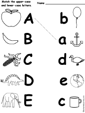
Above is a simple way for children to learn what letters look like in their case pairs. However what I find to be wrong with this activity is that it offers no challenge to a child, it simply gives them the answer and asks them to draw a line between the two.
This is an activity which I thought would be a great more advanced brain teaser for younger minds. The image asks the participant to connect the dots following the alphabet from A-Z. This could be a great idea do use, inkeeping with the previous theme, using one of the previous illustrations eg. a bear, and connecting the shape of the bear via this method.
This is another exercise that helps a child to learn the uppercase and lowercase versions of each letter, however I believe this one is more valuable to a child's development as It poses the question which lowercase figure reflects which uppercase letter. This would be a bit more of a challenge for a child as they have to think about the answer rather than simply being given the answer as in the previous activity similar to this one.
D.I.Y Letters
An idea that me and Caitlin came up with was to create nets on the inside of the cereal box so that the children could construct, keep and have on display their own 3d alphabet. For example: The B would be representative of boats and bears, and therefore this would be manifested in the design of the letter whether it be the design/shape of the letter as a whole, or a pattern covering the letter etc. Therefore when the child looks back at the individual letters they are able to remember everything they learnt and also use the alphabet letters they collect to aid with other activities or even use them for fun, such as to spell their name, and place on a shelf etc.
The back of the pack could conclude of a series of alphabet activities, the 3d letter being the last of them (could be done on a weekend) in which the children finish the cereal box and are given a momento of what they have learnt in the past week.
In preparation for meeting up with Caitlin I decided to brainstorm a coherant combination of games that could be put on the back. I chose these from my research, and came up with a couple of original game ideas:
The combination is as follows:
I knew that one of the strong ideas that me and Caitlin were confident above using, was creating an alphabet which children could cut out and have a physical copy. We wanted to relate each letter to an animal, and therefore I looked at animal alphabet visuals. (Shown on my context blog).
Me and Caitlin decided that the visual pieces we wanted to most influence our letters were as below:
With this in mind, and feeling inspired, I took a B character, in Helvetica bold, and printed this out at about a5. Using the B as a guide, I placed this under a layer of layout paper, and began to sketch around the B, simultaneously giving the letters the features of a bear. I had to keep in mind that we wanted the bear to take on the full shape of the letter, and not a select portion of it. With this in mind I began to sketch.
Once I was happy with the sketch I scanned this in and placed it into an illustrator layer. With the pen tool, I began to recreate the bear digitally using a pallet of colours that were simple, as the illustration is aimed towards young children, realistic, as to not confuse them, yet keep the style young and fun.
When working on the grizzly/brown bears expression I didn't want to disguise the natural personality of the grizzly bear, and so I showed him with an open mouth with the natural teeth showing. I battled between what was appropriate for young children, whether to give the bear a happy expression, or a wild one, however managed to find an in between which I think will suit the age group well.
Next I worked on the texture of the bear as I didn't want him to be one flat colour, I also thought it might be a good idea, and introduce more development for children if we were to emboss parts of the fur pattern, as to give the bear a tangible texture, playing with and improving the child's cognitive senses to further understand the appearance of a bear.
However I felt that the texture I had tried to apply by pasting waves across the surface of the bear didn't work to create a illusionary fur texture, that it looked inauthentic. I moved on to trying to create a different fur texture using smaller/thinner/straighter lines, in varying shades of brown. I found that the lower weight of the lines looked more authentic in relation to the previous thicker ones.
When I had applied this mock texture all over the surface of the bear, I looked for further ways to make it more credible, in terms of his fur consistency. I looked into the effects menu on illustrator, where I found that you are able to apply a grain texture to a shape. I gave the Bears body a gradient starting light and the top and growing into a darker brown.
I Increased the intensity and contrast of the grain, and changed the type to sprintkles, this gave the fur a more uneven and realistic effect.
The Bear B as it stands at the moment which I will take with me to show Caitlin in our meet up tomorrow.
No comments:
Post a Comment