Construction of grids.
Grids and Divine proportions.
-Before you can apply a grid you need to understand the requirement of the grid for the work to be produced.
-Thumbnail sketches will make the your job of layouts easier and productive.
Before drawing sketches consider if the publication is single page or double page spread. Consider columns, Is the piece going to be image or text heavy?
Implementing columns enables more freedom for design, 1 column for text and 1 for illustration. Columns can be subdivided for more variation. These columns can also be mixed together.
The larger the amount of columns, the smaller the typeface will be have to used, and text sections will be narrower. This is however reliant on the function needing to be performed.
A functional way to represent stats is through a four column format.
The width of the column dictates the size of the typeface used.
the rule is: The narrower the column the smaller the typeface.
When making thumbnails, make a wide range. Start by making small thumbnails. Then pick ones out you think will be appropriate for a project, these can be enlarged on a 1:1 scale, and again picking ones that seem more appropriate.
The first line must fit flush the the top of the column grid.
The last line must stand on the bottom limit.
If it does not fit the first time around, you may need to resize the grid field as it is too high or too low.
Example:
10 point type.
15 point leading.
15cm column length.
At this length there is 10 lines per grid.
text must lie on the line or just above the bottom limit of the grid when creating a continuos column of text.
Create the gutters to be the height of your text.
Font heights:
Caption text: 4 point type: 6 point leading.
Header and footer text: 7 point type: 10 point leading.
Body text: 10 point: 13 point leading.
Headline: 40 point type: 30 point leading.
Type and picture- 8 field grid:
8 field grids are used frequently for advertising material and brochures.
If using 8 field grids you can subdivide to 16 field grids.
8 and 16 grid fields give you a range of possibilities.
You know you have the right point size when a line of the text fits perfectly into the gutter separations.
8 grid fields allow various sizes of illustrations to be portrayed.
You can use with or without text.
Variations of an 8 field grid:
20 field grid is the best grid to start using straight away, with 42 possible layouts.
4 columns and 5 rows.
Tuesday, 26 February 2013
OUGD404: Week 2 page layout experiments.

Double page spread, with an emphasis on the vertical. The margins are: top- 5p0, bottom 8p0, left 4p0 and right 3p0. I do like this layout however I think I may prefer it with more emphasis on the horizontal. I enjoy how only the left side of the left page is used making the layout look less cluttered and more readable, also accentuating the photo on the mirroring side.


Layout that brings focus to the centre of the page, margins are same as above for single page, although I did not prefer the total use of horizontal above, I think the layout works well on this single page. I also like the use of type layout I have been using, that makes all my type sections appear in a perfect square or rectangle.

Considering layouts for a book etc. Creating text boxes with a custom shape to work fluidly with the picture. I like how the use of text almost acts as a mirror image of the picture, creating a balance.
Sunday, 24 February 2013
OUGD406: Communication as a virus 10,000 Steps.
Thursday 21st February.
Today we met up in college to discuss the ideas we have come up with in reference to research and any ideas where we could take the project.
Although I found the ideas I had gathered about developing an app and a website were amongst the strongest I had come in contact with, My group were hesitant about designing apps, as some just didn't want to, others were unsure how to develop design for app (I myself have never done this before) and others had developed apps for previous projects. Although I thought the research I had gathered was strong, the discussion turned to new ideas and another idea that came up was branding. Vicky had mentioned coming up with a new running/walking brand, and branding products used for such activities that would be sold at places such as go outdoors, and millets was also mentioned. This idea then also evolved into creating a running pack, this would include branding/ creating products such as water, energy bars, blister plasters etc, products it is assumed someone would need during a run, inside a branded bag. It was then suggested that we could do a 'festival' version of this pack, as people who attend festivals may use the products already inside, however I felt this was straying further and further away from our original research topic and people were starting to design for form rather than function.
Instead to reconnect the branding idea back to the topic '10,000 step' I suggested than within the pack we design an info graphic that suggests workout routines via running, and informs purchasers how increasing daily step amounts is easy and does not take a lot of time.
I don't particularly feel like this is the most appropriate way of answering the brief in terms of concept or method of delivery, however this is a group project.
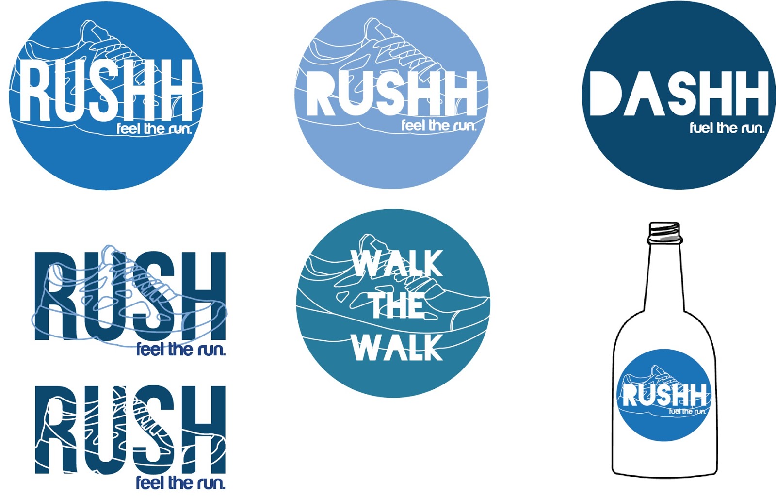
However I felt that I needed to do some work towards the project in order to get the ball rolling. I decided to start creating some possible design ideas for the brand logo, that could be used on the kit, and on the publication. I went with a theme of the running shoe. We had discussed previously in class that we would use either blue or green tones (changing the opacity to allow more of a range with the colour limit) as these were early, and also like a breath of fresh air. To create these possible logos I also had to come up with a possible brand name. For inspiration I began putting words into the thesaurus that related with running such as speed and fast. The word I wanted to work with most was 'Rush' followed with a slogan I came up with saying 'Feel the run', I inputted these details into a number of designs shown below.

Friday 22nd February.
Today we presented the idea we had come up with at the concept/conext/method of distribution crit, where Simon and Amber would give us feedback and offer us direction with our projects. Before entering the crit, I was quite unsure on what our concrete concept actually was. There were talks of a kit and a publication that could be sold in outdoors stores and displayed in gyms. I think it was also obvious to Simon and Amber that we were unsure about our concept. Before entering the crit, we were not aware that we were to create a piece of design that would have to work in the real world, and therefore the idea of creating a kit would not be successful as we did not have enough money to create several, and they also did not have much relation to the original brief 10,000 steps. However Simon and Amber did seem quite impressed that we wanted to create a publication that would persuade people, who already attend gyms, that as well as working out, it is a must that we also do our 10,000 steps. They also said we could manage the success of this idea by placing the publications on display in a gym, and returning a week later to see if any or how many had been taken.
Coming out of the concept crit me and Sam were not particularly convinced with the appropriateness of the resolve or how successful it would be, we sat down and started to brain storm how we could respond to the brief more effectively.
Instead of the kit, which we didn't think was particularly appropriate or interlinked with the subject of 10,000 steps we though the better idea would be to create a publication that would persuade and motivate people to walk 10,000 steps a day. We wanted to avoid the typical layout produced by walking and health magazines and create something much more minimalist, simple and not overwhelming to read.


Instead we thought that we could create a publiction that would be more tempting to read due to simplicity. This would be constructed through simple line drawings, infographics, black and white photography with an idea to screen print. Inside we could feature stories from those who have already got onboard the idea of 10,000 steps and are motivated about fitness, products they could purchase to encourage fitness etc. We did think that producing a publication could cost too much money, which we do not have, and so we came up with some ideas to keep costs down. Printing on news print is cheap, and only costs 2p a sheet, not only would this keep costs down but it also presents the magazine in a unique style to other walking magazines. We also thought we could create our own paper size as well, the simplicity of a square apparent shape seemed to be the favourite between us both. We thought that we could pass these publications out not only to people on the street but also put a set number of them into businesses in leeds such as local shops, cafes, hairdressers, in which we would return a short while later and see if any had been picked out to be used in order to measure success of the idea. We also thought of creating a version that could be displayed online so that everyone with access to the internet could come into contact with the information. We also thought about creating another product in the form of a sticker, of which would be included in the back of the publication in which people could wear, take pictures with whilst walking and upload them to proposed sites such as twitter in which followers would be further motivated to walk.
As a group we decided that the new idea of a publication, with links to such networking sites would be more successful and appropriate to the brief. We decided that the content would include motivational quotes, facts and information further backed up by illustrations or info graphics to provide a well rounded set of information and keep readers interested. The book will encourage people to walk, and show them that increasing the daily amount of steps you take each day to 10,000 takes very little effort. We can test the response to the publication through the pages we have set up via twitter whether positive, negative or none at all.
Deciding this idea on the friday, over the weekend I started to look at layout design of modern/minimalist magazine/brochure/booklet design, and came up with a possible layout/image/text design that I thought could work.


Nevertheless magazine - Inspiration hut.


Coming out of the concept crit me and Sam were not particularly convinced with the appropriateness of the resolve or how successful it would be, we sat down and started to brain storm how we could respond to the brief more effectively.
Instead of the kit, which we didn't think was particularly appropriate or interlinked with the subject of 10,000 steps we though the better idea would be to create a publication that would persuade and motivate people to walk 10,000 steps a day. We wanted to avoid the typical layout produced by walking and health magazines and create something much more minimalist, simple and not overwhelming to read.

Instead we thought that we could create a publiction that would be more tempting to read due to simplicity. This would be constructed through simple line drawings, infographics, black and white photography with an idea to screen print. Inside we could feature stories from those who have already got onboard the idea of 10,000 steps and are motivated about fitness, products they could purchase to encourage fitness etc. We did think that producing a publication could cost too much money, which we do not have, and so we came up with some ideas to keep costs down. Printing on news print is cheap, and only costs 2p a sheet, not only would this keep costs down but it also presents the magazine in a unique style to other walking magazines. We also thought we could create our own paper size as well, the simplicity of a square apparent shape seemed to be the favourite between us both. We thought that we could pass these publications out not only to people on the street but also put a set number of them into businesses in leeds such as local shops, cafes, hairdressers, in which we would return a short while later and see if any had been picked out to be used in order to measure success of the idea. We also thought of creating a version that could be displayed online so that everyone with access to the internet could come into contact with the information. We also thought about creating another product in the form of a sticker, of which would be included in the back of the publication in which people could wear, take pictures with whilst walking and upload them to proposed sites such as twitter in which followers would be further motivated to walk.
As a group we decided that the new idea of a publication, with links to such networking sites would be more successful and appropriate to the brief. We decided that the content would include motivational quotes, facts and information further backed up by illustrations or info graphics to provide a well rounded set of information and keep readers interested. The book will encourage people to walk, and show them that increasing the daily amount of steps you take each day to 10,000 takes very little effort. We can test the response to the publication through the pages we have set up via twitter whether positive, negative or none at all.
Deciding this idea on the friday, over the weekend I started to look at layout design of modern/minimalist magazine/brochure/booklet design, and came up with a possible layout/image/text design that I thought could work.


I liked the way in which this magazine, Dwell, found on Behance, used simple photography as its main focal point. Although this could be a good idea for our magazine, to retain simplicity, any photography would have to be black and white due to the restriction of colour. What I also like about this magazine is their use of quote and supporting information. Pictured above is an example of this, the magazine encourage readers to follow and instruction by writing something inspiring, which Is then backed up by more information seen in the minimalist body copy in the bottom right hand of the page. I feel as though this magazine Is quite a direct example of something we as a group are aiming to produce.
Whilst on behance I also found another minimalist design magazine which was very helpful. Below are images of magazine 'Run' a french magazine informing readers what a particular part of france has to offer in relationship to running.


I liked the simplicity of the branding which had been created for this magazine, particularly the logo which breathed simplicity, however I found that some of the pages were quite text heavy and the use of heavy text with so much black and white photography could sometimes make the magazine look quite pretentious and complex, rather then promote ease. This is something that we should look out for when creating our publication.


Nevertheless magazine - Inspiration hut.
I liked the simplicity in the magazine created through the use of colour, this publication follows the same specifications provided by our brief, 2 colours plus stock. The designer has rotated the use of red and blue for all body copy, headline and illustration. I also find it effective how the designer has layered these colours for further contrast.

This is a magazine layout I found on Designspiration, the aspect I liked most about this magazine was the separation of text from image by pages. The text is shown on the left and reflective image on the opposing page. I think that this kind of format would eliminate any clutter and keep pages/information clear and more legible to read.
After looking at these designs, and taking inspiration from the previous logos i had created for the proposed 'running brand' I began to construct a couple front cover layout ideas, which then could inspire format for the rest of the magazine. I had also come up with a possible name for the publication 'walk the walk' whilst Roxie had come up with another which was very popular 'Hit the road'.


We met up again on monday and wrote our brief. I also showed the group these 2 initial designs I had done however, the group after seeing these decided that they would prefer the use of simple illustrations to photography as we wanted to take the photographs ourselves, but we would not be able to take photographs to represent everything and so we decided on illustrations instead. BA (Hons.) Graphic Design 10,000 Steps | LEVEL | 4 | |
| STUDIO BRIEF | |||
| Brief |
You are required to produce a publication that motivates and encourages the general public to keep fit by walking 10,000 steps a day. Your response should consider the context of where the publication will be distributed and consider what will be appropriate for your target audience. This is something which you will need to identify as part of your initial concept proposal. |
| Background/Considerations |
What do you want to say? How do you intend to say it? What language is appropriate for your audience? Will the content be communicated primarily through type or image? If it is both what is the relationship between the two? How can your information be displayed through image? A limited colour palette, two colours plus stock. How will you tailor the content to suit this requirement? What are you aiming to achieve, how will you achieve this? What will you need to take into consideration in order to achieve this? How would this project evolve if it was to be continued in the future? What other outcomes would be made? How would this help deliver the message? Have you taken cost into consideration? What choices will need to be made? Have you thought about future mass production? What size will your outcome be? Will this be effected by your audience? Will this be effected by practicality? You should resolve this problem by the deadline stated below. However, if you have plans to extend the scope and ambition of your response beyond this deadline you should include these proposals in your presentation. |
| Mandatory Requirements | Deliverables |
Your response should remain within legal boundaries. NB - Any activities that may cause damage, personal offence or involve acts of an illegal nature are not encouraged or supported by the delivery of this brief. You must seek appropriate permission for all activities associated with this brief. | Design development sheets. Concept/proposal appropriate to your idea. 3 x A2 presentation boards identifying: Concept Content Method of Delivery Publication encouraging walking. |
| Studio Deadline | Module Deadline |
Friday 8th March 2013 | 3rd May 2013 |
With a concrete idea for the publication, I then went onto plan what could become the content of our piece, others went onto consider the aesthetics however I was more concerned about the function of the piece and its purpose rather than its aesthetic in initial stages. We decided that each person in the group would design two pages with content. Roxie had picked a colour scheme, we had decided that we wanted to use either blue/greens as these were earthy colours linking into the idea of walking, I also suggested the fonts we should use, I thought that BEBAS would be a clear choice to use for headlines, facts and quotes and Helvetica could be used for further information such as body copy. The lack of ornamentation in the typefaces meant for easily communicated information which would not be distracted by the typeface in which it was written.


We were also very much inspired by the book, 'Whatever you think, think the opposite' by Paul Arden.


We liked the way in which Paul Arden had used simple illustrations such as the image of a goal above, backed up by an inspiring quote, and minimal information to back the quote up. It was also effectively minimal in the way he used colour usually limiting himself to two plus stock per double page spread. Although we liked the layout of this book, we preferred the idea of having the main text (quote) on the left hand page and supporting infographic/ information on the right hand side.
with this being said, Sam decided to create a unique paper size which we had previously agreed would be leaning towards a square shape, and also the sequence of point sizes which would be used for the publication and be in proportion to one another. We decided in reference to the paper size that we wanted the publication to be ergonomically comfortable to hold in ones hand, whilst also have the ability to fit in a pocket, or easily slide in a bag, to prevent the publication being thrown away instantly.

The point size we decided on for the quotes was 39.5pt. If we needed any text to be larger or smaller we would multiply or divide 39.5 by 1.62 to get a proportionate value.
I started to look at the way in which people move around cities, I looked into a book written by an Urban planner called Kevin Lynch whom wrote a book called 'Image of the city'. In his book he describes how people navigate around cities. He found that people found their way around cities by focal points called nodes and landmarks which are the most identifiable points in a city as people use these landmarks as points in a mental map, using them to connect places together.
I therefore started to look at landmarks which I thought stuck out the most from Headingly, to the bus station, which spans from the north to the south of the centre.
The reference points I chose were:
- Headingly Carnegie stadium
- Hyde Park
- Leeds University
- Merrion centre
- Leeds train station
- The Corn exchange
- Leeds city bus station
Using the colour scheme that Roxie had chosen, I created a simple line illustration, determining each of the landmarks from one another through the layout shown on google maps.

I then began to do the maths that would determine the average amount of steps that would be taken between each point.
I used some information from livestrong to help identify the average measurement of a human step.
'Average stride length depends on many factors, including gender. The average step or stride length for women is smaller than for men. According to the University of Oklahoma Health Sciences Center, a woman's average step length is approximately 26 inches and her average stride length is 52 inches. A man's average step length is approximately 31 inches and his average stride length is 62 inches. For walking programs, women are encouraged to use an average step length of 26 inches and men are encouraged to use an average step length of 30 inches.'Read more: http://www.livestrong.com/article/438170-the-average-walking-stride-length/#ixzz2NLTCraEy
Due to the average step length for a woman being 26 inches and for a man 31 inches, I took both measurements added them together and divided them by 2.
26+31= 57/2= 28.5 converted into metres which is the measurement I have chosen to work in is 0.72, which I have rounded down to 0.7 to make solutions easier.
26+31= 57/2= 28.5 converted into metres which is the measurement I have chosen to work in is 0.72, which I have rounded down to 0.7 to make solutions easier.
I then found out the distance between each of the landmarks converted this into metres and divided this by my step length, thus giving me the amount of steps taken between the calculated points.
I then inputted these numbers into the roads shown between each point.

After designing the map, I wrote some complementary information that informed the use of the map, along with a complementary quote on the reverse side. I had to put the quote on the reverse side as the map would already take up a double page. Therefore I thought that this would have to be a special fold out piece in the centre of the publication.
'Put on your shoes, lock the front door, leave the car keys at home and you’ll be well on your way to walking 10,000 steps a day in no time. We have drawn up this useful map so that you can see how to increase your steps per day without feeling like your doing much work at all. Whether you’re going to work or meeting a friend in the city walking is the most beneficial way to travel. Not only will regular walking boost your health, It will boost your wallet too. Imagine the amount of money you would save without payments for public transport, taxis and petrol, and all you have to do in return is place one foot in front of the other, it’s that simple. '

I then moved on to create my second page that was inspired by an image that I had seen posted on my newsfeed on facebook. I instantly posted this image onto the group we had made on facebook to communicate with each other.

I then created a simple illustration of a modern 10,000 steps pedometer to complement the information that I had given.

The group then met up to see what everyone had put together. Only me Sam and Vicky had created page ideas, mine and Sams appeared to look quite similar and so we went with a style that was a mix of the two. At this meeting Vicky had also presented an idea for the logo which would be used on the front cover, she had used the same circle concept that I had presented earlier, using Roxie's new pick of colours and other motifs. The group weren't a 100% sure about the new design and so we left that to be continued.

Also whilst we were away designing pages Roxie had thought of a good money saving idea, she had thought that, each of the pages could be turned into small flyers, with only the quote on one side and information about retweeting to our twitter or visiting our instagram on the back. These fliers would then be distributed by being attached to balloons and set of from one of the college balconies, thus reaching a further audience from outside Leeds.
We then decided to distribute jobs, Roxie would work on the design for the fliers, Me and Sam would work on creating the publication, Vicky would design a website also displaying the information, and Mel and Daisy would create some packaging ideas as part of the group were still wanting to create a prospective walking kit.
Although I did not think the walking kit was particularly relevant at all now that the project had evolved a lot, Mel and Daisy were not particularly keen on designing for publication, and so they carried on designing for the packaging which we had now labelled a prospect piece of work (what we would do in the future with more time and money). The kit could be ordered on the website (coming soon) If anyone was interested.
We also found that printing the publication was going to be a large expense with the amount of pages and the amount of copies we would have to print out and distribute in leeds. And so we also decided to label this project as a future prospect. We will still make the publication, however put it up on the website with the ability to be ordered or dispersed If we had more time and money.
In the meeting we also decided that me and sam would take another look at the front cover design, creating something still minimalist, but more eye catching than our pervious ones created.
We took our ideas into the crit and people seemed pleased and impressed with what we had come up with, they did however alert us to an element to the flier designs we had forgotten. What if we set the balloons off and It rains? The flyers would get ruined. What could we do to improve our idea? In order to make them weather proof we decided to laminate the fliers, so they would not get destroyed in the typical english rain.
After the meeting and crit, Me and Sam decided that we would design as many pages as we wanted each and pick the best out of the collection to put into the publication. Over the weekend I designed 13 possible double spreads and a possible front cover idea. My designs were not only inspired by the quotes Roxie had come up with but information that I had found myself.
- 'Walking is 12 times better for the climate than driving.' quote

- 'There is no elevator to success, you have to take the stairs' quote

- Now punch that laziness in the face and have a great day. image


The next is inspired by a quote that Daisy had found earlier on in the process with her written information which I put into the consistent style and illustrated.

- Accept the challenge so that you may feel the exhilaration of victory. Image


- 'Success is the sum of small efforts repeated day in and day out.' quote

- 'No matter how slow you go, you're still lapping everyone on the couch.' quote


- 'A mans health can be judged by which he takes two at a time - Pills or stairs. quote

- 'People say that losing weight is no walk in the park. Yeah, thats the problem. quote

The potential front cover I had designed after these pages was inspired by the illustrations I had drawn for each page and the reoccurring circle motif that the rest of the group seemed to like. I have also included the title 'Hit the road' which Roxie came up with and we all agreed on.


Me and Sam then met up and compared/ showed each other the designs that we had created and our possible front cover designs. As a group we chose to go with Sams front cover design as It was most minimal.

However the only problem I found with this design is that it does not reference that the publication is linked with leeds (map of leeds) or that it is to do with 10,000 steps. However this is slightly referenced in the inclusion of the twitter, Instagram and email. With this in mind I created an inside cover that displays the publication has some regard to Leeds.


I then decided to make a printing appointment on the thursday, the day before we were presenting ideas to the rest of the class, to ensure that we would have an example publication to demonstrate to the rest of the class. However It had gotten to Wednesday and not all of the group had been available at the same time to pick the best pages for the publication, and so I emailed back and forth with Sam putting the publication together myself and picking which pieces I thought were most appropriate. In the end 13 of Sams pages were included and 10 of mine. I set the pages up in a way that the illustration/infographic would appear on the reverse of the quote, this is because we planned to perforate the pages so that they could easily be torn out of the publication and put on ones wall.

I then went to the print appointment the next day and printed out the whole publication. However with the mass of pages we couldn't bind the book in the way we had originally planned. We were planning to put all the double pages inside each other and staple them together, however the book was too thick to be help together by staples. I then thought that the idea of stapling would not work out however other members of the group continued to cut each page separately and staple it together half by half, however this still looked untidy. I was slightly upset that I had paid for and waited for this copy to be printed for it to be made messy with staples. If i had another opportunity and the funds to reprint the book, I would have liked to have stitched it. However this is how the booklet looks as a finished product. I am very pleased with the overall aesthetic and content of the publication, It is consistent with the flyers we attached to the balloons aswell as the site that vicky has designed. It is both motivational and encouraging as we had planned, and adheres successfully to the rules of two colours plus one stock. If I were to remake the publication again I would probably take some of the pages out as I think the amount put together could be seen as slightly overwhelming.
After me and Roxie had also printed and laminated the flyers we met as a group and let them off, we did have a couple of hiccups with the balloons, we found that after we had laminate the flyers, the each balloon by itself could no longer handle the weight of the flyer due to the laminated sleeve. Instead we had to pair the balloons up meaning we could only send out 12 instead of 24.


People who receive the balloons are encouraged to tweet back to us or send us a picture of them receiving the balloon, to the Instagram that Roxie set up or the twitter that Vicky set up. As of presentation day we have not yet had any replies.


Vicky also showed us the final set up the website she had created, I was very impressed with how she had created the page transitions is if the viewer is walking from page to page, the use of branding and colour/typeface is also consistent to the publication and the flyers. Vicky designed the whole of the website in programs illustrator and indesign, and a friend who was studying web design helped her to html the website. The website also reflects the simplicity and ease we are trying to project.


We also met up with Daisy and Mel on thursday, and Daisy the group the proposed packaging designs, which she had now created without Mel, and Mel had created posters, using the quotes and illustrations we had put together for the publication to put up around college, inspiring students to walk 10,000 steps, thus targeting yet another audience to the balloons, publication, flyer and website.
However we found that when we met up Daisy and Mel had planned, and Daisy had produced packaging ideas using the old logo that Vicky designed, she had already printed this out so It could not be changed. We found that through out the whole process of working as a group, although they both had the ability to visit the facebook page and interact with it as much as the rest of us, neither visited the page once or discussed any ideas, which meant a lack of communication and an inconsistency within the work produced as a whole. However the fonts colours and stock used were still the same with implied some consistency.

Submitted pieces.

Flyers. - Roxie

Future publication. - Me and Sam.

Website - Vicky.

Future Packaging - Daisy.
Posters - Mel.

Instagram - Roxie.

Twitter - Vicky.
Subscribe to:
Posts (Atom)