Throughout our studies we have been given a brief to work on alongside our other projects.
Brief.
Produce an alphabet based on one of the letterforms you created from the Alphabet Soup, Visual Thinking brief. Once again you are restricted to using one colour and it is to be produced in CMYK (cyan, magenta, yellow, key). Although you are restricted to one colour you experiment with opacity and half tones.
Before we began to work on this brief directly we attended three sessions in which people alike to me, who had never or barely used Illustrator were able to learn the basics and begin developing these skills. The tools in which we worked with were; The pen tool, working with different weights, strokes, manipulating these via the width tool. We also worked with the Pathfinder tool, Uniting, deleting and layering shapes in order to create new forms. Using the blend tool to play with colour, layering shapes to produce other Images, and creating outlines. The below Images illustrate my development in each of these areas.


Developing the illustrator alphabet.
When I had constructed my 10 letterforms, I had designed them to represent my word extract mor subtly then obvious. I had a focus of abstracting the term rather than representing it directly. I had however designed one character that was more visually true to the term extraction than others. However during the power crit in which we had together my partner chose 5 of my most subtle pieces. Nonetheless each of my letters were taken down, most probably due to the emphasis on my indirect designs. Due to this reason I have chosen to base my alphabet upon my most obvious design. Extracting a tooth.

In order to begin the design process, taking inspiration and using the same font (Bambi bold) I had used in the previous brief I began to draw my letters by hand, which I find most useful and successful for initial design ideas. Placing these into Illustrator, using the pen tool, I traced around the image starting with the original letters outline and then drawing around where the image of the tooth breaks the boundary of this. Then editing the width of the outlines to create more depth. In my original letter above I have used acrylic paint to develop tones and contours, when figuring out how i would translate this into illustrator I began to look at the tools and realised there was no airbrush tool. This is how I had planned to recreate these hues. Instead I began to play with the pencil tool, drawing the contours with my graphics tablet changing the width of stroke and opacity to create a form of shading which can be seen in the below right image. I will continue to use these techniques throughout my alphabet.


I had also considered as an extra idea, to create some glyphs to add to my alphabet. the first design I had thought of was for the semi colon. Where I had pictured a tooth visually being extracted from the gum, the tooth creating one half of the character and the gum underneath creating the second. I have followed the same initiative for shading, taking the colour darker for the gum to contrast the colour of the tooth.


Brief.
Produce an alphabet based on one of the letterforms you created from the Alphabet Soup, Visual Thinking brief. Once again you are restricted to using one colour and it is to be produced in CMYK (cyan, magenta, yellow, key). Although you are restricted to one colour you experiment with opacity and half tones.
Before we began to work on this brief directly we attended three sessions in which people alike to me, who had never or barely used Illustrator were able to learn the basics and begin developing these skills. The tools in which we worked with were; The pen tool, working with different weights, strokes, manipulating these via the width tool. We also worked with the Pathfinder tool, Uniting, deleting and layering shapes in order to create new forms. Using the blend tool to play with colour, layering shapes to produce other Images, and creating outlines. The below Images illustrate my development in each of these areas.
Using the pen tool to create lines and shapes whilst applying the width tool to create contrasting weights.

Creating outlines of fonts to then manipulate its original shape.

Using the blend tool to connect shapes in a range of ways, in order to appreciate the blending of colours. Layering shapes in order to establish new forms whilst applying colour to again change its dynamic.

Here I am experimenting with the media of stroke evident in the top image, the use of gaps in strokes and the start and final shape of strokes.

Here I learnt to use one of my favourite tools the Pathfinder tool. The 'g' you can see with white fill on the write Is one I have traced using the pen tool, the one on the left I have constructed via uniting, and cutting shapes away from others. Below this I have started to make some shapes and apply gradients to construct a face. I then went home and continued to play with the skills I had learnt to construct a emoticon like face of an old man.

Developing the illustrator alphabet.
When I had constructed my 10 letterforms, I had designed them to represent my word extract mor subtly then obvious. I had a focus of abstracting the term rather than representing it directly. I had however designed one character that was more visually true to the term extraction than others. However during the power crit in which we had together my partner chose 5 of my most subtle pieces. Nonetheless each of my letters were taken down, most probably due to the emphasis on my indirect designs. Due to this reason I have chosen to base my alphabet upon my most obvious design. Extracting a tooth.
In order to begin the design process, taking inspiration and using the same font (Bambi bold) I had used in the previous brief I began to draw my letters by hand, which I find most useful and successful for initial design ideas. Placing these into Illustrator, using the pen tool, I traced around the image starting with the original letters outline and then drawing around where the image of the tooth breaks the boundary of this. Then editing the width of the outlines to create more depth. In my original letter above I have used acrylic paint to develop tones and contours, when figuring out how i would translate this into illustrator I began to look at the tools and realised there was no airbrush tool. This is how I had planned to recreate these hues. Instead I began to play with the pencil tool, drawing the contours with my graphics tablet changing the width of stroke and opacity to create a form of shading which can be seen in the below right image. I will continue to use these techniques throughout my alphabet.


I had also considered as an extra idea, to create some glyphs to add to my alphabet. the first design I had thought of was for the semi colon. Where I had pictured a tooth visually being extracted from the gum, the tooth creating one half of the character and the gum underneath creating the second. I have followed the same initiative for shading, taking the colour darker for the gum to contrast the colour of the tooth.


I have also found whilst developing this alphabet that the same process to produce each letter does not work, this can be seen in the 'O' for example. Below is the 'O' I have quickly drawn and then traced up in illustrator. I feel that this particular process does not accentuate the O, that it is almost a step backwards from the original O from the typeface Bambi bold. Therefore I started to think of other ways I could design this particular letter so that It remained coherent with the rest. When looking at the shape of the O and attempting to link it with that of a tooth, I pictured an above perspective of a molar, I have been inspired by the image below right.


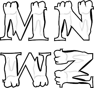
I then started to design letters that were more focused on vertical stems and crossbars. I started to think of more ways in which I could intertwine the appearance of a tooth with my original bambi bold typeface.
I began to consider using a tooth as part of a letter rather than commanding the outline of the whole letter. I started to look at other tooth types that I could manipulate into letters and came across this very useful diagram:

(http://lawsofsilence.blogspot.co.uk/2011/10/aucamville-project-10-teeth-in-walls.html)
I realized that the tooth drawn bottom row 4th from the left, has a visual similar to that of an incisor would work well for letters with vertical stems. And so I created a stencil first for the I, which I then re-used and manipulated slightly for each of the following letters.


As you can see in the stencil, the part of the tooth that would be visible and breach the gum, forms the top of the spine of each of the letters. The part of the tooth that wouldn't be visible as it would be below the gum line is shaded, by drawing strokes that range between 5 and 10 pt, and turning the opacity down between 5 and 20%.


After designing many of the letters in the alphabet, I decided to come up with a second design in which I could use for letters that had an emphasis on the vertical and horizontal in order to create range. These letters had more of a visual focus similar to figure f (molar) on the image above (bottom row) Again I created a stencil in which I manipulated for each letter, often designing a letter, and then flipping it to create coherency within the alphabet.

For the last alternation of letter type I took the letters which had a larger emphasis on the curve for these I followed the same guidelines as the first letters I designed, altering the shape of the whole letter subtly to resemble that of a tooth. However I then began to add features that mirrored the visual of a tooth below the gum line, these attributes in particular would be seen breaking the borders of the letter form.

I then began to play with stroke and opacity, making some letters darker than others in order to create more depth. I also experimented with the width tool solely on the black outline of each letter form to increase intensity.
Darker opacity's and tone can be seen in Glyphs such as C,G and Q.

I have also created a second glyph in which I have deleted the bottom full stop from the semicolon, In order to leave the tooth which shall resonate as the full stop.
Finished typeface.

When considering what stock to print my alphabet upon I had considered to use either matt or a more textured paper, Although the matt paper would have looked crisp and clear when printed upon, I wanted to chose a paper in which would really accentuate the tone, and appreciate each of the different opacity's I had used. Therefore I chose to print on Harman FB paper. A paper in which would highlight the range of tones. Below is the final piece printed out on Harman FB paper.


I am very pleased about how the alphabet has printed and the quality of print on this style of textured paper. Something I have noticed since printing is that the alphabet almost appears to be hand drawn which I consider quite effective as it is an illustrative type. One thing that is quite frustrating about printing A1, is only being able to see it at actual size once you have printed your final piece. Next time I would consider doing a test piece on my own A1 paper (cutting the print cost to £2) to check the appearance at this scale, and also compare colouring and tone. If I could go back and change something about this piece it would be to apply darker opacity's to a few more letters in order to increase coherency.
No comments:
Post a Comment