The first idea I came up with really concentrated on the farcical tone of voice which is so prominent in the movie, almost as much as the actual storyline itself. There is a moment in the movie, which I previously mentioned in which the main character Oscar climbs outside of the plane he is on and clutches to the wing, in a move to get attention from his fellow passengers and friends. This one moment highlights how farcical the movie actually is.
The idea of the poster is to create an illustration of exactly this. A simple representation of the tone of voice of the movie.
The second idea I came up with played upon an icon / object in the movie. The poster would have a simple illustration in the centre focusing upon the trunk which Freddie is put in when she is pushed out to see. The trunk would take upon the aesthetic of a treasure box, filled with money and jewels, professing and representing the fortune of Freddie whom is shipped off inside it.
The next Idea was again to play upon the fortune of Freddie by simply taking her body shape and constructing it by creating a repetitive minimalist pattern of dollar signs.
The fourth concept was the same representation as previously seen above, however exchanging the dollar signs for a consistent pattern of dollar bills.
Another simple idea I had was based both upon the Marriage of Freddie and Oscar, and the fortune that they would now both have entitlement to. The poster shows simple figures in wedding outfits being showered by confetti shaped as dollar signs.
I continued with the theme of Freddie's fortune for the next approach, another Idea that I had was again taking a motif from the film, the small pond which Freddie is put in after passing out from drunk, in an attempt to drown her.
My favourite two ideas were taking the iconic moment from the film where Freddie is dumped into the pond and left to drown. And the image of two people getting married, and been showered in confetti made of dollar signs to represent the idea of being married into fortune. I sketched up both of these ideas.


I chose to go with the idea of illustrating Freddie laid in the fountain as I thought it was more relevant and specific to the film, whereas the other idea was very general. I also found that looking at the contours of this object that the faces of the two main male roles could be incorporated into the sides of the object to create the contours.
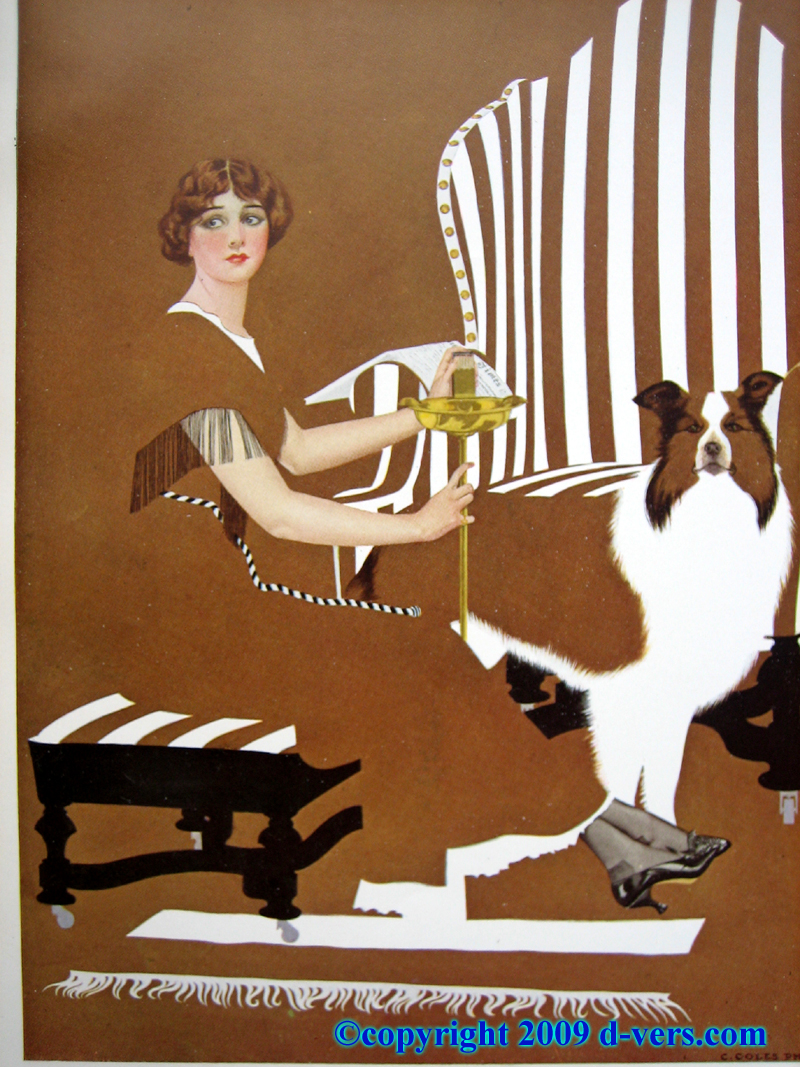
I thought that this idea was strong as I had noticed when looking at design previously that the use of negative space was a very popular style throughout the 1920's. The era in which the film is set. Such clever manipulations of negative space can be seen in the works of Coles Phillips, an American artist and illustrator, whom used this style in his editorial and advertising work.


Therefore I decided that my final idea was the strongest due to the identifiable 1920's style and the clever incorporation of all 3 characters in the poster.
Next I also started looking at the correct colour pallet to use. I looked at the colours prominently seen in 1920's design, anything from illustration, to fashion and decor. The limit of colours is a maximum of two plus stock, I wanted to try and use this to my advantage by picking a colour pallet of 3 similar shades. Using the paper as the lightest tone, and my two allowed colours as a mid tone, and a dark.


From the pallets above, I found that the most prominent and frequent colours were warm reds and oranges, warm yellows and ochres, and creams/beiges. There were also some appearances of blues/greys and greens.
I also looked at colours seen in the film:


This also gave evidence that the most appropriate colour pallet would be either beiges/yellow ochres and warm oranges.
I found a great example of how these colours had been layered in another poster on Alternativemovieposter.com to create depth, light and shadows.

I constructed my colour pallet by swatching from the pallets above. My final pallet features a medium brown, a dark yellow ochre, and a cream (the colour of the paper I will print on.) I chose these colours as they were the most intermittent colours seen throughout the pallets I found above, as well as common shades within the movie. I can use the medium brown colour as the outline, ochre gold as a shading colour and then have a cream coloured stock.

Now that I had both the illustration Idea and colour pallet down for the poster, I could start working on digitalising the idea. As I already knew exactly what the illustration was going to look like, I started with any typography I was going to place on the poster.
First I had to decide what information I would want to display on the poster, it is mandatory that we have to include the title of the movie, however I would also like to include other information such as the producer of the movie and the 3 main characters.
In terms of the typography I was very much inspired by 1920's / Art deco style pieces of graphic design and type. I found when looking at these pieces that there was an emphasis on repetitive use of lines, to frame or ornament a design.
In terms of typography, the typefaces were very strong, bold and geometric, It is important, even though this film was produced in 1975, to represent the era it was set in.


I preferred for my poster a typeface similar to the 3 fonts at the bottom of the list, I felt that implementing a typeface with such excessive lines would not be complimentary to the much soft illustration I prepared. I found a font online very similar to the one below:
I typed up the name of my given film in this typeface along with the colour pallet I had prescribed for the poster.

With this in place I then considered how instead of using a typeface heavily adorned with lines, I could ornament the typography with this aesthetic. Using lines to form a border round the title instead. By doing this I will still be using 1920's aesthetics, in a way that is more appropriate for my poster and illustration.

I then added in the name of the producer to the top left of the piece, and the names of the three starring roles to the bottom. I tested this out on a cream background.

With this in place, I scanned in the illustration I drew, ready to digitalise it.

I looked to see how the combination of the medium brown would look with the gold ochre shade, I felt that between the cream background and the outline, the gold colour was a great mid tone.
I also decided to use the brush tool instead of the pen or pencil as this would give the illustration a smoother appearance.

Liking where the direction of the illustration was going, I carried on outlining and layering the drawing with colour.


After layering the colour I finally got to a place where I was happy with the illustration.

However I tried experimenting with making the faces in the stand of the fountain more prominent be introducing facial features.

However I felt that adding these ruined the minimalist aesthetic I was going for, and the 1920's prominent style of negative space, therefore I reverted back to the original idea.
I then combined the illustration with the piece of typography.

I was very happy with the end outcome, however I felt that the top seemed quite imbalanced to the bottom, as the illustration was solely based in the middle section of the design. I quickly adjusted this by extending the repetitive line motif into the top corners of the poster to make my final design. I am very happy with the end outcome, and how considered and reflective it is of the film, through a combination of art deco type and lines, layering of colours and the colour pallet itself.

Submitting the file to Alternativemovieposters.com

No comments:
Post a Comment