- Never use complementary colours together.

Complimentary colours do not work well when placed together, then often make things such as text hard to read and unbearable to look at.
'Colors opposite one another on the color wheel are called Complementary with an ”e”. This is different from the word Complimentary with an “i”'
'When complementary colors on the color wheel are placed next to each other, they make one another appear more intense and brighter.'
quotes.
- There are two types of print techniques optical mixing and physical mixing.
- optical mixing: Layering colours (CMYK) to create a desired colour.
- Physical mixing: flat colour.
In order to create a lighter or darker version of the colour, the dots would be moved further apart, infusing more white space and creating a lighter shade. and then minimising the white space in-between the dots to create a darker shade.
when colours are dense we cannot see the dots, in less dense colours the dots are further apart.
In YCMB/K optical printing each of the 4 plates are rotated out of sync so they are offset and you can see the existence of each plate.
-Graphic designs sole purpose is to communicate a message.
'Graphic design is a creative process that combines art and technology to communicate ideas. The designer works with a variety of communication tools in order to convey a message from a client to a particular audience. The main tools are image and typography.' quote
-Everything produced must be readable and legible otherwise it has no purpose.
Legibility- Is the degree in which we identify individual letters / glyphs based upon understandable and recognisable appearance. (The clarity of individual letters)
Readability - The ease in which text can be read and understood influenced by length, primary or secondary, leading, justification, type style, kerning, tracking, point size etc.

An example where text is illegible.
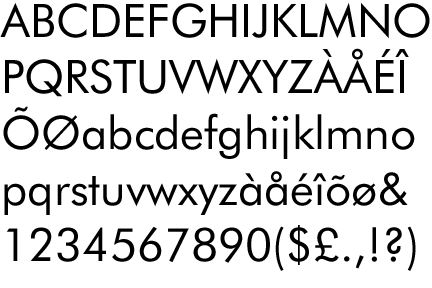
-Four weights of font make a typeface:
Block - headers
Gothic - Sans serf
Roman - Serif
Script - Brush
Block font - LOT

Gothic font - Futura

Roman Font - Kefa

Script font - Lobster

-Semiotics refers to the way in which we interpret things according to a set of rules.
All that is necessary for any language to exist amongst a group of people is the concept that one thing will stand for another.
Semiotics
Symbol- What the image represents.
Sign - The brand/ company in which it is representing.
Signifies - What it suggests and implies.
For example:

Symbol - Symbolises a bird.
Sign - Represents twitter - social networking.
Signifies - Happiness, talking/tweeting - plays on old style of communication.
- FORM FOLLOWS FUNCTION.
'There are two ways to interpret the phrase “form follows function”:
Descriptive: beauty results from purity of function;Prescriptive: aesthetic considerations in design should be secondary to functional considerations.
DESCRIPTIVE INTERPRETATION
The descriptive interpretation favors simplicity to complexity. It states that beauty results from purity of function and not from ornamentation. This ideal derives from the belief that form follows function in nature. Is this really true?
Actually, the opposite is true. Evolution passes on genetic traits to subsequent generations without any rationale for their purpose. Each generation of a species then finds a use for the form it has inherited. Function follows form in nature.
Applying functional elements to a design is generally a more objective process than applying aesthetic elements. A functionally objective process results in designs that are timeless but may be perceived as simple and uninteresting.
PRESCRIPTIVE INTERPRETATION
The prescriptive interpretation prioritizes functionality over all other design considerations, including usability, ergonomics and aesthetics.
Aesthetic considerations in design should be secondary to functional considerations. Is this interpretation problematic? Does it lead designers to ask the wrong questions about a given design?
This interpretation would seem to lead to designers to ask what should be omitted from a design. What elements of a design do not serve a function and thus ought to be removed? Should the form of a design be determined solely by its function?
Taken to the logical conclusion, every element would ultimately have the same design. Every functional item would have one and only one design. Before an object’s form could be changed, it would need to serve a different function.' quote
- Subliminal communication is design that communicates a message or idea beyond the edge of perception.
example:
Body Wisdom

A logo for a high end spa, that focuses on treatments such as massages etc, professes wisdom not just through the name but through the clever use of illustration, the combination of eyes and hands creates a metaphorical visual of an owl, known for their wisdom.
- The eye contains two types of receptors, one called cones and the other, rods.
- The rods portray shades of grey whilst the cones allow the brain to perceive colour.

- Colour modes
RGB- Colours projected by light - on screen.
CMYK- Cyan, magenta, yellow, key - black is classed as a primary but only as key colour.
CYMK also refers to physical colours such as, pigments, paints, inks etc.
10 Things you need to know about graphic design - book.
Design process.
In order to start the design process, I first wanted to make a custom paper size rather than rely on those regular sizes such as a4/ a3 etc. To do this I repeated the stages of the fibonacci sequence, until I came to the paper size that I thought was most appropriate. I wanted this to focus on the horizontal, being wider than tall. Below is an image of the final product and the paper size I will be using throughout the book.
208.5mm x 152mm.
Below shows the size of the page in reference to an a3 sheet of paper.

To get started producing possible layouts, I created a range of thumbnails based upon the papersize above, in which I created spaces where text and image could be interchanged. On these thumbnails I experimented with amounts of columns/rows, size, rule of thirds, or 20 box grids and angles, alongside possibly breaking the boundaries of the grids.


From these thumb nails I chose 12 which I thought would work most successfully and re drew them on a larger scale, hoping to use these for my final publication.
I then began to take some of these chosen 12 layouts and apply them to the 10 things I wanted to communicate. I began to accommodate sections for certain elements such as headers, body copy and images.
Below are images of the initial plans for each of my pages.
I had decided on my initial plans that once I had set the margins, they would be constant for each double page, to ensure that whilst layout/ columns/ rows are interchangeable there is still consistency.
I wanted certain margins to be slimmer than the others and some wider, the thinnest of the margins would be the right band side, the pages are being binded at the left hand side, and so this needs to be the larger of the vertical margins allowing the right to be slimmer.
In reference to the horizontal margins, I thought it would make the publication easier/ more efficient to read if the bottom margin was larger than the top, pushing the page contents further up the page, limiting how much the reader has to move their eyes downward. I also wanted to make both horizontal margins larger than the vertical in order to again emphasise the custom page size I made which has an emphasis on the horizontal.
Final margin sizes.
Top margin - 6mm.
Right margin - 3mm.
Bottom margin - 10mm.
Left margin - 5mm.
I have also decided that gutters across all pages will be 3mm wide, again to ensure consistency.
For all of the pages I will rotate between using the 20 box grid ( 5 columns 4 rows) and the rule of thirds, combining the two and subdividing these guides where I think necessary.
The colour scheme that I wanted to follow is in keeping with the minimalistic style, I want to rotate the colours of each page between black, white and a vibrant colour, which I will decide on during the process.
Below is the plan for all the left pages, these will be used to introduce a subject, almost acting as a title page.
For these pages I predominantly used the 20 box grid to produce the layout.


Left leaf: 1

Left leaf: 2

Left leaf: 3

Left leaf: 4
For the next leaf I wanted to bring in the third colour and so I experimented with a few to determine which I thought worked the best.


I liked the colour combination using the berry colour, the contrast in colour of orange against black and white seemed slightly too shocking and the blue not vibrant enough and so the berry appeared as the mid colour.
Left leaf: 5

Left leaf: 6

Left leaf: 7

Left leaf:8

Left leaf: 9

Left leaf: 10

Right leaf 1: Never use complementary colours together.

I will create this layout so that the boxes are of an equal size, consisting of one column and two rows for each, using a 20 box grid (5 columns, 4 rows)

In Image which I plan to keep minimalist to match the rest of the book, in the abiding colour scheme which relates to the text will take up the top box, whilst the supporting body copy lies underneath.

I thought about the supporting Image and found that I could not create something with the complementary colours as I had a very strict colour scheme. I thought however that most people would know what the complementary colours are, as we learn them in secondary school, just incase I chose to explain their purpose and where they could be found in the body copy. Instead I decided to draw an illustration which perceives a negative image to support the text.

Final Design.

Right Leaf 2: There are two different ways of mixing colour.

Using the two outside columns from the rule of thirds grid, and splitting these between, header, body copy and image.


I created some very simple illustrations in illustrator to display the two types of colour mixing that would reflect the minimalist style I was trying to inkeep.


Right leaf 3 : Everything must be readable and legible.

When creating this section I wanted to create a layout, that still emphasised unreadability, but conformed to the minimalist Layout I had been using throughout. Instead of taking the obvious path and playing with the obvious visual aspects, such as layering, aligning text backwards. Instead I began to play with an idea I had thought of, 'If a piece of text is unreadable it might as well be in a foreign language.' I began to plug the word 'readable' into a translate tool, to find a language which was totally indistinguishable from English, this was Russian.


Final design:

Right leaf 4: There are four fonts that make up a typeface.

I have decided to use this layout for the four fonts as it seems very appropriate and there is space in which I can apply each element I am wanting to communicate in an easy clear way.
The four fonts 'Roman, Gothic, Script and block' can be centred down the middle column, whilst supporting body copy for each of the font lies on the reflecting sides as shown below.


Final Design:

Right Leaf 5: Semiotics is the way we interpret symbols according to a set of rules.

Using 3 simple columns from the rule of 3rds to separate each of the signs, symbols and signifiers from each other. 3 columns need to be separated into Header, example image and supporting body copy.
- Use the same example of sign/symbol/signifier that I found for research at the top of this post. Example to use is twitter.


Final Design:

Right leaf 6: Form follows function.


For this layout I wanted to have a simple header with body copy underneath, to really emphasise the idea of form follows function, which I think is a rule the whole design of my spreads tends to follow.
I also wanted to think of a way in which visually shows that form follows function.
Below is my grid set up with the header and body copy sections applied.

I put into place the relevant body copy.

From this I came up with a visual idea for the title. To have the word form look as if it was literally following the words function. I did this via implementing footsteps between the lexis.

Final design:

Right leaf 7: What is subliminal communication?

I wanted to keep this layout simple again, alike to the previous layout, however I wanted to play with angles, for a possible supporting Image. The above box flushed to the right is where my body copy about subliminal communication will be applied.


Body copy is flushed to the right and uses rows 2/3 of the 20 box grid.
Below is the illustration I create din illustrator tracing the original image of the body wisdom logo.

Below I have increased the size of the illustration, and put it at a more unconventional diagonal angle. When I change the angle of the image, the illustration overlaps the page borders and breaks the grid. I however think this looks effective, and makes a change for the eye, from the rest of the layouts I have created which stick to the grids.

Final Design:

Right Leaf 8: The way the eye processes colour.


Here I wanted to create a simple layout with an emphasis on the diagram, as this gave out the most vital information.


Below is the illustration I created of the eye, using the eye I found in my research and Re drawing it to fit the set up of my document.

I separated the body copy into 2 sections. flushed left and right.

The left displays general information, and the right more specific information.
I added these two concepts together for the final design.

Right leaf 9: There are two different colour modes.

For this spread I wanted to experiment with the use of columns and rows. For my previous layouts I had chosen to keep most of my text/images/headers flush to the same columns. However I wanted to create a layout by random selection of columns, and again breaking the boundaries of the grid, and placing illustrations around these selected spaces which will overlap the outer perimeters of the page.

The spread explains about the two different colour modes.
RGB Is the colour mode that words with light, on screen etc and CMYK refers to the physical attributes of colour such as inks and paints. I wanted to create a few illustrations which reflected this idea.
RGB:
CMYK:


Below is the layout with the text applied.

With the illustrations applied, breaking the boundaries in normal view.

Final Design:

Right leaf 10: What is the difference between a typeface and a font?

I decided to split this layout in a similar fashion that I had designed my form follows function spread with a 20 box grid ( 5 columns and 4 rows ) using the centre 3 columns to justify all text, and the top two rows.
The header for the page 'Typeface .vs. Font' will be applied to the top box an the supporting body copy to the bottom.


Layout with the corresponding Header and body copy applied.

I thought that this layout looked slightly empty and so I wanted to include a supporting image. The title inspired me for this, using the idea of .vs. I drew up a pair of box gloves in illustrator and applied them to the centre of the layout.

Final Design:

In order to create a front cover for the piece I combined all the illustrations I made for the book on one single leaf. The illustrations did not follow any formal arrangements and many brother the perimeters of the page.

I left the centre of the image blank as I wanted to put a circle here with the title of the book on. I placed he circle in the centre 4 subdivided columns. With the inside information '10 things you need to know' flushed to the centre two.

In order to make sure people knew that It was a publication about graphic design, I also added a title bar to the top of the page. I liked this concept as It meant that the design could be implemented for a series of books, for example 10 things you need to know about Architecture etc.
Below is my final front cover design.

I also wanted to create a simple greetings card page for when someone would first open the book, to prepare them for what they were about to read.
again I took one of the illustrations from the project, the speech bubble, and placed it in a random order all over the page.

Taking a large version of the speech bubble I placed it in the centre 3 columns of the 5 column set up.
Inside this speech bubble, I applied a small welcome note on what the book was about.
See the final design below.

I was pleased with how the book came out after printing, however there was one problem that occurred. In one of the studio sessions I was advised to change the colours of a couple of my layouts. I had previously used black body copy against a pink background on a couple of the pages. I had thought that this looked ok, and was readable and legible. However when my peers looked at my design on screen, one suggested that I should change the colour of the body copy to white.

Before going to print I changed the colour of the body copy to white.

On screen the colours looked just as readable as one another, this was probably due to the idea that the berry/pink colour is a mid tone and white and black are at opposite end of the spectrum. Nevertheless I stuck to white as it was the colour that had been recommended.
I did however find that once I had printed the book that the white wasn't easily readable and it would have worked better if I had used black. However with no time available left to print, I am unable to change this, If I were to improve the book further, I would change the colour of the body copy back to black.
No comments:
Post a Comment