Saturday, 15 February 2014

OUGD505: Studio brief - Initial design decisions. (Research publication)

Before I began to think of the design for the inside pages I wanted to concrete design decisions for the front and back cover as these would inspire the inside of the book.

I looked back to my research that I had done about Yankee candle design, as I want to make sure the book I am going to create is coherent with the rest of the brand. 
I found that the brand had a very consistent design thread throughout the years that it had been around with a few special editions. It is Yankee candles consistently traditional identity that has attracted and continues to attract its loyal customers. I wanted to continue with Yankee candles already, well built brand. 

Yankee candle has already taken advantage of the book shape/motif in a couple of its products. Here they have used a book as a structure for a box. I noticed that although the book designs differed slightly, there were in fact some aspects that stayed the same across the range of designs. A traditional approach is taken to any font choice, these from what I have seen are clean script fonts (as a pose to overly hand drawn) and serif fonts used in mainly all capitals. (This would have to work for headers but small case serif would have to be considered for body copy.) Colour selection seems to be quite traditional with the use of jewel/ royal colours, strong reds, golds, navy, forest greens and white. Any textures which appear are also classic, for example the fairisle/ knit print seen in the bottom image. 

The shape of the book structure is the same across all three books and replica of that of a case bind, the box takes advantage of the natural wear and tear of a case binded book, when they become old and are naturally compressed within a bookcase the spine of the book curves under the compression.


I want to imbue the same sense of traditional craftmanship within the publication I make. Therefore It would be appropriate to create my publication using a case bind to reflect the products of Yankee candle. The boxes seen below are also an indication of how I could do my packaging for my book. When opening the cover of the book there is a window in which the user can see the products placed within the box, I could continue with this idea for my box, creating a window for my book. 


Below I have created an initial idea of how the book would appear with a case bind, and how it could could slot into a box of this format. Using the images I have collected in my research I tried to draw up the possible box to be as authentic to the original as possible. 

The drawing shoes a similar yet not exact format of a box close to that of the original yankee candle one. I believe that the box I have designed is much simpler than the one shown above by Yankee candle. My design eliminates the struggle of playing around with tabs and folding sections to close up the box when finished. I also think that by implementing a pull out drawer format it eliminates the problem of the fold up side become weak and not being able to hold the contents anymore. The box has the same window design as the original by Yankee candle, and the drawer which slides in and out does not impede the view through the window of the box.  


I liked the idea of staying true and original to Yankee candle, and so for the next two packaging ideas I stayed true to the yankee candle book motif, making slight changes to try and improve the appearance and stability of the piece. 

My next idea focused on the idea of stability where I decided to combine both Yankee candles original box idea (with folding tabs) and the sliding tray. If made out of a thick enough stock the the folded tabs should be strong enough to hold the tray in without snapping under tension. This is something I will test at a later stage. As shown in the diagram the book slots into the tray, and the tray is slid into the larger box where the edges are folded in to ensure the tray does not slip out. 


The slipping out of the tray is an issue that could arise in the first design as there is nothing to hold the tray in. However looking back at older yankee candle designs, a red ribbon has been used to hold the front and back cover together, this could solve this issue. 

The third and final net I designed is quite a bit different to the previous two. This design has no open sides where a tray is able to slide in and out. The inside box (tray in previous design) Is fixed into the box during construction. This tray however is slightly different to the others. It harvests a 'pillow' underneath the book, as seen in boxes for items such as iphones, so that the surface of the book is even to the edges of the box. There is a thum gap at the right of the book to allow for easy access to the book. This tray is placed inside the box during consrtuction so that the only piece of material that can be removed is the book, through the main window. This idea would completely solve any issues of the box becoming too weak. 


For the aesthetic/printed design of the piece I looked for inspiration from their previous products, where I came up with the idea of 'opening the door on the legend of Yankee candle' the front of the box would have the aesthetic of a door, and as this is in a book format, the box would open, as would a door. 

The piece of previous Yankee candle design that inspired me the most was the snowy house votive candle set which features its own doorway. I debated how I would get the peace to fit in with the classic Yankee candle brand that had already been established, as they use a lot of photography and have just started to branch out into illustration. And so I found some helpful guidance from this piece which uses real life textures and gradients combined to create and integration of photography and illustration. 


I then went on to consider the book which would be placed inside the draw as shown in the sketches above. The idea I had was to make the aesthetic of the book appear like a parcel. Bounded in a parcel wrap texture like brown craft paper, with a red ribbon criss crossed over the front. 


This idea arose from the concept of having a parcel posted through ones door. (as this is what the front cover of the box will ressemble). But I needed to think of a way in which I could apply the title of the book to this aesthetic. 
One idea that I thought of was to have a design on the front of the book which resembled a gift tags as seen on parcels. However I didn't want the design of the book to appear too celebratory themed as the purpose of the book was to tell the story of Yankee candle, not to wholly celebrate it, and so I went back to the drawing board. 
I thought more about how people label parcels when I came across one rather fitting idea. A wax seal. 


Wax seals were an emblem used to prove the authenticity of documents and are known to be entirely traditional. Exactly how Yankee candle appears to be. However it is not solely the link of classic style which I believe drew these two ideas together. Not only would it make the book appear to be the authentic story of Yankee candle, and an important document. But the wax seal plays entirely upon the Yankee candle brand, much like the seals are made from wax, so are Yankee's biggest selling point, the candles.

I drew up a plan of how it would be possible for me to make my own wax seal. Using the laser cutter, I could cut through a circle and then engrave my design into the surface of the circle of wood. I would then cut out a few more circles of the same thickness and size and stack these on top of the engraved plate to reinforce it. Followed by a stack of smaller wooden circles on top to form a handle. If the laser cutter didn't engrave the design deep enough I could go around this with a narrow nibbed soldering iron to deepen the design. The lettering would not be too delicate as I plan on doing the design much larger than a regular wax seal.


The design I did was very simple. In the centre of the stamp shows the classic Yankee candle jar with a love heart in the centre, a commonly used motif on other platforms such as online and on carrier bags. 


Surrounding this motif is the title of the book in a circular motion ' The story of Yankee candle' which will be written in the brands typeface Book Antigua used for other elements such as the logo, so that the book is consistent with the rest of the brand. 

I created a digital mock up in illustrator of what the book front would look like using a parcel paper texture, with mock red ribbon and wax seal ontop.


OUGD505: Studio brief 1 - Structure of publication and body copy.

Today I went through my research and split it into 8 sections. This seemed an appropriate way to structure my book as the length of the publication has to be 16 pages, therefore 8 double page spreads. 
The 8 sections of research I will be putting inside the book are:

- The history of yankee candle/ how the company started and grew.

- Why is Yankee candle so successful?
- What products are most popular? 
- Target audience / activities. 
- Yankee candle design.  
- The effects of scented candles.
- Fun facts about Yankee candle.
- How Yankee candles are made.

I then put these into a chronological order that would read better, proper organisation of material Is also just as important as the material selected for the book. 


1. The history of yankee candle/ how the company started and grew.

2. Why is Yankee candle so successful?
3. What products are most popular? 
4. The effects of scented candles.
5. Fun facts about Yankee candle.
6. How Yankee candles are made.
7. Target audience / activities. 
8. Yankee candle design. 

I wrote each section of the body copy in my own words using the information collected in my research, as the front cover design/identity of the book had taken on a traditional book/story theme, I wanted this to shape the delivery of the body copy. Giving the text a more fictional feel as a pose to sold facts and bullet points etc.


The history of Yankee Candle/ How the company started and grew:


In 1969, in South Hadley Massachusetts a young boy called Michael Kitteredge was trying to scrape some money together to buy his mother a christmas present. With not enough money, Michael decided to craft his mother a homemade present. A scented candle he made from melting crayons. 

Michaels neighbours became very interested in the candles he made, and then he began to make them in larger quantities for them too.
With the success of Michaels hand crafted candles growing, two of his high school friends joined him in business and together they founded America's best loved candle company, Yankee Candle.
In 1993 after an illness scare, Michael handed his company over to a friend, and it went public in 1999. Yankee candle was then picked up buy large chain stores such as Bed, Bath and Beyond and Linens-N-Things and success grew even more. 
From that point Yankee candle passed through the hands of many great leaders with the company bounding from one triumph to another. As of 2013 Yankee candle was sold to Jarden for $1.75 billion dollars.  

Why is Yankee candle so successful?


There are a range of elements of Yankee candle which make it so loved be many, but this can be shortened into four expressions: Authentic. True-to-life. Bold. Long-lasting. Yankee candle have a range of 150 scents to take you on a journey down memory lane, whether you prefer food and spice scents, floral, fresh, fruit or a festive scent that sends you back to a favourite christmas, Yankee candle does them all. Because of this Yankee Candle hold the bar for scented candles, of which other candle companies are constantly trying to top. This is where Yankee candle gets its true to life label from, Yankee candles have an extremely long burn time, making delightful scents for up to 110 hours with the large jar candles. 

However Yankee candle like to throw in a limited edition scent every now and then to keep their customers on their toes such as Witches brew at Halloween and a special sweet shop of flavours at christmas. As an extra something special they also revive an old retired scent which has proved to be a favourite. 
Never satisfied, we're continually developing new fragrances that reflect the best experiences of life, from a kitchen treat to a tropical holiday. Plus, we're launching innovative ways to enjoy those fragrances in both candles and flameless fragrancing products for every need."With every fragrance we introduce, our reputation is on the line. It is not enough for a Yankee® fragrance to be as good as our competitors' scents. It must be better, because it's what you expect of us... and what we expect of ourselves. Each fragrance has to possess the realism, accuracy and pleasantness of the true flower, food, fruit, place, or experience that inspired it"

What products are most popular/ products do they sell?

Pink sands jar candle. 
Chocolate truffle jar candle.
Lavender jar. 
Pink carnation jar. 
Black cherry jar. 
True rose jar. 
Red Velvet. 
Turquoise sky. 
Raspberry. 
Deep sea. 
Wedding day. 

List of products:
Jar Candles:
- small
- medium
- large 

Tumbler candles:

- small
- large

Pillar candles:

- small
- large

Tea light candles.


Wax melts.


Samplers/votive candles. 


Candle holders:

- Jar
- Cylinder
- Votive
-Tea light

Candle trays. 


Wax melt warmers. 


Fragrance warmers. 


Jar candle shades. 


Illuma-lid jar candle toppers. 


Fragrance spheres holders.


Scent plugs. 


Reed diffusers.


Wax melts. 


Concentrated room spray. 


Scented potpourri. 


Room Aroma for roomba.


Car and small spaces:

- Smart scent vent clip.
- Car jar ultimate. (gel)
- Car jar. (card air freshener)
- Almost anywhere jar.
- Car vent stick.
- Travel tins.

Gift cards. 


Limited edition sets / products for special seasons.


Effects of scented candles:

The sense of smell is one of the most powerful human senses. The scented candle business has continued to grow due to the powerful effects that different scents can have on mood, Yankee candle has been quick to notice this with its forever flourishing line of hand crafted scents. It has been noted that certain scents can dictate a persons mood, and relieve problems such as insomnia, High blood pressure, depression and generally improving vitality and spirit.

Lowering Blood pressure:
It can be found that lighting a scented candle and being exposed to the smell for a certain amount of time, can relieve problems such as high blood pressure to the same extent of having a meditation session. The most effective scent of lowering high blood pressure is spiced apple. Yankee candle have a spectrum of spicy apple scents including; Spiced apple, Spiced macintosh and Spiced apple berry. 

Combating insomnia:
There are a select range of scented candles which help to improve peoples capability of falling asleep. The main scents of subduing insomnia are Lavender and Sandalwood, whilst Lavender induces a more positive mind frame, the combination of Lavender and sandalwood is known to help those who don't sleep easy to have a deeper more tranquil nights sleep. Yankee candle exhibit a range of combinations of these scents including; French lavender, Lemon lavender, Lavender vanilla, Sandalwood and Sandalwood vanilla.

Bettering symptoms of depression:
Although scented candles do not provide a remedy for serious illnesses such as depression, they do provide moments of brief alleviation. Scents such as Jasmine, Camomile, peppermint, and lemon help the brain to free negative emotions and tension. Other fragrances such as Cedar, Vanilla, rose and Cinnamon help bring out positivity in people by sparking the remembrance of happy memories. 

Spirit boosters:
Three candle flavours which are known to improve energy levels are citrus fragrances such as Orange, Lemon and Grapefruit. Citrus scents improve energy levels and empower the immune system, making people feel more well and defending them from sickness. Whereas the scent of Grapefruit directs people to be more bright and active, making people seem more upbeat and feeling much more high spirited. Yankee candle encompasses a whole range of fruity scents that make up a fifth of the entire Yankee candle scent collection.

  
Facts:

200 Million: Number of candles produced each year by Yankee Candle.
1 Billion +: Number of candles the company produced in the past 5 years.
4 Million Ft.: Amount of wick the company uses in 1 year.
50 Million Pounds: Amount of wax the company uses each year. That works out to 137,000 pounds each day! 


How Yankee candles are made:

  • GLASS
    The glass jars used by Yankee Candle® are made especially for Yankee Candle® in accordance to specific guidelines. Yankee Candle® requires glass to be lab-tested to ensure the appropriate strength and consistency of the glass.
  • WAX
    Every Yankee Candle® has a custom blended wax formulation to ensure the optimum melting point and ability to hold fragrance oil. In addition, when properly burned, these special wax formulations help maintain an even, clean burn.
  • COLOR
    If you were to cut a Yankee Candle® jar in half, you would find that the wax is richly colored throughout the candle. The beautiful hues are specially selected to enhance your overall fragrance experience.
  • SCENT
    Yankee Candle® is known for room-filling and authentic fragrances. Our passion for fragrance leads us to develop the world’s most unique scents. Yankee Candle® fragrance oils are complex combinations of top, middle, and base notes that are developed across the globe to bring you the very best fragrance experience.
  • WICK
    An important aspect of a Yankee Candle® is the wick. Not all wicks are made alike. In fact, Yankee Candle® uses over 200 different wicks in their candles. Each fragrance and candle form has a wick that is chosen specifically for that item. That means that the wick you find in one fragrance might be completely different from the wick you would find in another fragrance. 

Target audience/ Activities:

The most loyal customers of Yankee candle are middle aged women whom enjoy collecting Yankee candles as a hobby, many of them enjoy sharing their new purchases and growing collections across social media websites. However Yankee candle have not ruled out other audiences, creating a scent collection aimed specifically for men including fragrances such as; Riding mower (a scent of fresh cut grass) and MMM Bacon! This was not one of Yankee candles most successful lines, as their customer demographic is mainly female, who would not opt for these scents. Nonetheless most of the auras available at Yankee candle appeal to both genders ( Food and spice, Festive, Fresh and fruit), with the floral section housing more feminine scents. However there is also an up and coming audience with Yankee candle, in form of a younger generation. More and more young people are posting about Yankee candle on social media platforms such as Instagram, a site used mostly by 18-29 year olds.  

At the two main Yankee candle stores also known as the Yankee candle villages in South Deerfield, MA and Williamsburg, VA, there are many activities available to take part in for even the youngest of Yankee candle customers. These activities include, Dip-your-own candle, an exercise in which you can pick any candle from the selection at the booth, and dip this into your preferred colour wax. Dip-your-own wax hands is another fun and greatly creative activity available to do at the Yankee candle village where you are invited to dip your hands in wax creating a mould of your hands in any shape you desire. The last Yankee candle experience available is Make your own Jar candle, In which visitors are given a classic Yankee candle medium jar, and are able to fix it with a combination of Yankee candle wax of their choice from the selected counters.   

Yankee candle design:

Yankee candle is an honest and traditional brand from the first candle ever made in 1969, to the process implemented to produce their 200 million strong candles a year, and the labels stamped onto each jar, Yankee candle is true to life in everything It does. The most common, and earliest from of Yankee candle branding pays homage to traditional photographs of the bespoke fragrance combinations inside each candle. However the rise of a younger audience has seen Yankee candles branding evolve to interest its younger customers with Occasional use of illustration. Yankee Candle have also grown their innovative branches by designing limited edition gift sets such as the Christmas sweet shop edition, the Christmas tea light advent calendar, The favourite things votive book and other special edition flavours such as Halloweens 'Witches brew' and 'Candy corn'.    


Tuesday, 11 February 2014

OUGD503: RESPONSIVE - Studio Brief 2 : Collaborative brief (Bear)

Bear Cereal.
Collaborative brief.

The brief:


The Creative Challenge
We want you to bring the alphabet to life on the back of our Alphabites boxes. We hope this will appeal to graphic designers and illustrators,
but how you approach this is up to you. You might continue the idea of celebrating and editorialising ‘one letter per box’ or you might have ideas that bring in one or more letters at a time. What will the back of yourbox/boxes look like? How will the content inspire and engage kids? How will you build excitement among kids, and anticipation for future boxes. Will boxes look the same stylistically or will you propose variation from one box to the next?
You might want to focus on helping us do what we’re already doing better, or taking a step back and looking at the Alphabet creatively from a different viewpoint. 

I began looking into alphabet activities for children that helped them to learn, interact and engage with the alphabet, for example:


If the pack was focusing on the letter 'B' have a selection of illustrations as one of the activities and ask the users (children) to colour in the illustrations that are representative of beginning with the letter 'B', for example:


colouring in the bear. 


colouring in the boat. 

I thought that this would be quite a good activity for children to learn letters of the alphabet, and associations of these, much like in the roles of semiotics, without the activity feeling too instructional and educational. The activity would allow the children to be educated, but it also opens the window of creativity and is quite a craft based activity. 


A classic game is word search, A simple educational task, Children could then be asked to find the words which they have coloured in, in the word search.


Applying words to the images they have identified starting with the letter B adds a new dimension to learning. 


Above is a simple way for children to learn what letters look like in their case pairs. However what I find to be wrong with this activity is that it offers no challenge to a child, it simply gives them the answer and asks them to draw a line between the two. 


This is an activity which I thought would be a great more advanced brain teaser for younger minds. The image asks the participant to connect the dots following the alphabet from A-Z. This could be a great idea do use, inkeeping with the previous theme, using one of the previous illustrations eg. a bear, and connecting the shape of the bear via this method.


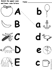
This is another exercise that helps a child to learn the uppercase and lowercase versions of each letter, however I believe this one is more valuable to a child's development as It poses the question which lowercase figure reflects which uppercase letter. This would be a bit more of a challenge for a child as they have to think about the answer rather than simply being given the answer as in the previous activity similar to this one. 


D.I.Y Letters


An idea that me and Caitlin came up with was to create nets on the inside of the cereal box so that the children could construct, keep and have on display their own 3d alphabet. For example: The B would be representative of boats and bears, and therefore this would be manifested in the design of the letter whether it be the design/shape of the letter as a whole, or a pattern covering the letter etc. Therefore when the child looks back at the individual letters they are able to remember everything they learnt and also use the alphabet letters they collect to aid with other activities or even use them for fun, such as to spell their name, and place on a shelf etc. 
The back of the pack could conclude of a series of alphabet activities, the 3d letter being the last of them (could be done on a weekend) in which the children finish the cereal box and are given a momento of what they have learnt in the past week. 

In preparation for meeting up with Caitlin I decided to brainstorm a coherant combination of games that could be put on the back. I chose these from my research, and came up with a couple of original game ideas:
The combination is as follows:


I knew that one of the strong ideas that me and Caitlin were confident above using, was creating an alphabet which children could cut out and have a physical copy. We wanted to relate each letter to an animal, and therefore I looked at animal alphabet visuals. (Shown on my context blog). 

Me and Caitlin decided that the visual pieces we wanted to most influence our letters were as below:


With this in mind, and feeling inspired, I took a B character, in Helvetica bold, and printed this out at about a5. Using the B as a guide, I placed this under a layer of layout paper, and began to sketch around the B, simultaneously giving the letters the features of a bear. I had to keep in mind that we wanted the bear to take on the full shape of the letter, and not a select portion of it. With this in mind I began to sketch. 


Once I was happy with the sketch I scanned this in and placed it into an illustrator layer. With the pen tool, I began to recreate the bear digitally using a pallet of colours that were simple, as the illustration is aimed towards young children, realistic, as to not confuse them, yet keep the style young and fun.


When working on the grizzly/brown bears expression I didn't want to disguise the natural personality of the grizzly bear, and so I showed him with an open mouth with the natural teeth showing. I battled between what was appropriate for young children, whether to give the bear a happy expression, or a wild one, however managed to find an in between which I think will suit the age group well. 


Next I worked on the texture of the bear as I didn't want him to be one flat colour, I also thought it might be a good idea, and introduce more development for children if we were to emboss parts of the fur pattern, as to give the bear a tangible texture, playing with and improving the child's cognitive senses to further understand the appearance of a bear. 


However I felt that the texture I had tried to apply by pasting waves across the surface of the bear didn't work to create a illusionary fur texture, that it looked inauthentic. I moved on to trying to create a different fur texture using smaller/thinner/straighter lines, in varying shades of brown. I found that the lower weight of the lines looked more authentic in relation to the previous thicker ones. 


When I had applied this mock texture all over the surface of the bear, I looked for further ways to make it more credible, in terms of his fur consistency. I looked into the effects menu on illustrator, where I found that you are able to apply a grain texture to a shape. I gave the Bears body a gradient starting light and the top and growing into a darker brown.  


I Increased the intensity and contrast of the grain, and changed the type to sprintkles, this gave the fur a more uneven and realistic effect. 


The Bear B as it stands at the moment which I will take with me to show Caitlin in our meet up tomorrow. 


OUGD503: RESPONSIVE Studio Brief 2 : Bear cereal - Collaborative brief contract.