Sunday, 23 March 2014

OUGD505: Yankee candle - Research publication layouts.

Yankee candle. 
Research publication layouts.

Now that I have the content for all my pages, I can start working on the layouts of the pages and how I will format these in my book. It is very important to me to represent Yankee candle with the traditional nature and personality the brand already has. 

For this reason, i have decided to start laying the book out in a very traditional layout, I created a range of sketches, defining how each page would be laid out in the book. Although I wanted the book to seem quite traditionally laid out, I still wanted to inject some interest and fun into the book, as Yankee candle is lowering its age on its audience range. I tried to adhere to this by interchanging the layouts, and also plan to do some totally illustrative pages. 

Page plans:

History of Yankee candle:


The layout for this double page spread is probably one of the most traditional in the book, using a clear heading at the top left, the mid sections of both pages for images, and the bottom section for short easily readable columns of body copy, which I have previously written. 
I have also decided to use a couple of elements consistently across every page design, these are a border design which will wrap around all the information on every page. On pages with a heavier amount of body copy these will be sectioned off at the bottom as shown on this page design with a single line, to make the page easier to scan and read. The book is only small format (A5) and so not separating the text from images may cause it to look cluttered, especially with a mix of illustrations and photographs.  

Images needed: 
- Illustration of first every Yankee candle. 
- Photographs of Yankee candle store.


Why is Yankee candle so successful?


The second double page spread is almost a mere reflection of the first as again it is quite heavily dominated by text. The right page however uses the page design but is slightly more experimental as there is more room to play with, using smaller images and less text.

Images needed:
- Photos of the 5 different groups of Yankee candle.
- Yankee candle logo. 


Yankee candle popular products:


This page will use the sam heading format on the left page at the top, followed by using the mid area to house the photographs of the 8 most popular Yankee Candle fragrances. The lower section will again be used for body copy. 

Images needed:
- Photographs of 8 most popular Yankee candle fragrances.


The effects of scented candles:


I created a slightly different layout for this double page spread, I did use the same heading placement as the other spreads, however I have placed the images and body copy in a slightly different order. As this spread is probably my heaviest one with body copy, with 4 sections instead of two, I have come up with a layout in which can house this in a more interesting way than the previous spreads. 

Images needed:
- Illustrations of four different fragrance groups. 


Fun facts about Yankee candle:


This is the double page spread in my book with the least amount of body copy as the double page spread is only house 2 small facts, one on each page. For this reason this spread will be the most illustrative and experimental in my book, I questioned whether as there was such little text, if I could bring some kind of hand drawn, ornamental lettering into the layout, much like that seen in traditional books? 


How Yankee candles are made:


For this page I am trying to illustrate the process in which Yankee candles are made and so I have designed a spread that follows the aesthetic of a timeline. Illustrating the process of jar to wax to colour to fragrance and wick across two double page spreads. 

Images needed:
- Illustrations showing the process of making Yankee candles. 


Yankee candle for everyone:


Yankee candle for everyone will follow the original layout I created which looks most like the traditional aesthetic of a book. Heading at the top, Images in the middle and text and the bottom. 

Images needed: 
- Photograph of man candles. 
- Photograph of Yankee candle village. 
- Photograph of Wax hand mould activity. 
- Photograph of candle dipping activity. 

Yankee candle through the years:


The last spread will be the most image based spread in the book as the focus is to talk about the evolvement of aesthetics within the Yankee candle brand. The left hand page will have some text at the bottom to describe this, where the rest of the space, most of the left page and the whole right page will be used to illustrate via photographs the change and growth of Yankee candle.

Images needed:
- Photograph of Yankee candle starting out. 
- Photographs of Yankee candle design/ products as they have evolved. 


Thursday, 13 March 2014

OUGD505: TYPOGRAPHY WORKSHOP.

TYPOGRAPHY WORKSHOP.
SESSION 2.
13/3/2014


Point size, weight, colour.

How can heirarchy be determined without altering these elements?
Through position/ orientation. 

Rotating words also effects the heirachy, as words of a different orientation to straight are more difficult to read. By placing a word upside down, you give it the function of the last word to be read on the page.


10-12 is the maximum amount of words we can have on a line. Novels have around 10 words per line. 6 is the minimum amount of words that should be on a line within bodycopy. 

Indent 3-4 letter spaces.
Don't need line space and indenting, use one or the other. 


Wednesday, 12 March 2014

OUGD503 RESPONSIVE: Studio brief 1 : Susan clark design development.

When I spoke with Susan we arranged to meet up to discuss her ideas, and possible directions to take her branding elements. However as work was quieter than normal at this point I decided to come up with a possible to design, so that I could show the client. Bringing something to the meeting would also help me to determine her likes and dislikes, based upon the piece I had done. 
I already knew the types of products that Susan sold as she posts images of her products on her Facebook page. We had also discussed where abouts the client would be distributing products in the summer. She had wished to stock these at craft fairs and small boutiques. 

This was my inspiration for my design. I really wanted to capture what made everything sure produced so special. Everything is one of a kind, made by hand and made with love. This is exactly what I wanted to emphasise within the design. 

I focused on the two main elements of the business, Knitwear and Jewellery. I really wanted to do illustrations for the business cards, Susan's stock constantly changes as she only creates a few of each products and once sold, moves onto the next design. Because of this, If I were to use photographs to represent her business, they would soon appear dated. 

I began with a simple concept, creating a business card with a cable knit background, I sketched this below. I found that giving the card an appearance of a knitwear texture was a simple and effective way of illustrating this half of her business. When it comes to the time to take this idea into illustrator I will simply create a vector image trace from a cable knit photograph to gain a true to like representation.


I then questioned how, over the texture of cable knit I would incorporate the other side of the business, Jewellery. After a bit of consideration I decided upon the idea of creating a motif in the centre of the card that would consist of a circle (Shaped and designed to look like a piece of jewellery) with Susan Clark printed in the middle. 

I came up with two different designs for this idea and sketched them up. I took inspiration from Susan's jewellery pieces, particularly her necklaces and bracelets which use a lot of charm type details. 
The first design is the simpler of the two and resembles more of a bangle shape than a chain bracelet. I feel that this simple design will work well with the detailed background, not competing with each other but complement each other. I also kept the charms on the design simple, staying with one shape to again avoid too much chaos. 


The next design was more detailed than the previous, and was more realistic in terms of looking like the pieces which Susan creates. I drew up a simple link chain illustration, however I think that this design is more more detailed than the above and therefore could push the design to be too busy. I kept the simple shape of the charms again, but I don't think that this makes the design any simpler, and so the decision between the two depends upon wanting to keep the design readable, or wanting to have a truer representation of the clients business.  


To try and solve this decision I layered the bangle like design over the cable knit design and held it in front of a light to see what this combination would look like when layered. I liked the combination of the two very much together, and felt that seeing them in context, that to add any more detail to the piece would tale away from the design and possibly cheapen this lovely hand crafted brand. 


With the background elements in place, I turned to look at the typography for the piece. As the aesthetic of the brand is dominantly driven by hand rendered pieces, I wanted to carry on this habit with the type as well. I found a typeface online that I thought would be really fitting for the brand as it was a clear representation of hand written text. The font is called Bombshell and is a flowy and feminine hand written font. However the font is £30 pound to purchase and my client has quite a low budget, and I also couldn't see myself using it frequently, and so buying the font isn't really an option. Instead I decided to create my own personalised typographic piece to avoid purchasing costs and make the project even more bespoke.

I practiced drawing out the clients name with similar characteristics until I was happy with the outcome. I then drew it up large format, so that when scanned in the text would appear very clean and neat. 


Now that I had all the elements in place for the business cards I began the digitalising process. My first point of process was to find a cable knit pattern similar to the one that I had sketched up earlier. I found one online very similar to the idea I had previously drawn up, this is shown below. 


I imported this into illustrator where I image traced the texture to gain a vector image which I could manipulate. At this point I also wanted to work on the colour scheme at this point. My focus, with the design being very organic base so far was to target the crafted feel by keeping the colours very earthy and organic. For this reason I looked into the type of stock that I could print the design on. This is when I thought about relief printing onto a different colour stock, mainly an earthy colour. This is where I came up with the idea of relief printing the design on craft card. Craft card again would be a further representation of the core of the company and the process in which the products are made. 


I found that on online websites such as etsy sold ready cut business cards in the exact stock I was looking for in bulk for a very reasonable prices. This would be almost perfect for my clients budget and the aesthetic truly reflects the personality of the business. 

For colours that would be relief printed I envisioned keeping the colours in the pallet similar to one another, and to provided some light to the design. For this reason I came up with a colour palette inspired by the colour of the stock I was printing on. 


The cable Knit pattern in the background would be a lighter shade of the colour shown underneath. I hate created this in illustrator why colouring in the pattern white and giving it a low opacity. This colour however is only a reference as the cards could be relief printed, when relief printed the client will have to mix ink or paint that is similar to the digital reference. 


Next I moved onto digitalising the centre motif on the business card consisting of the bracelet symbol and typography. I created the bracelet using the brush tool, again another nod to the home made identity surrounding and encompassing the project. This was completed using white so that It stood out from the background but also supported and worked with it, to further the brands organic dynamism.  


The typography that I hand drew was also then added in the same white colour, inside the motif to keep consistency and again support the rest of the design. 


Once I had the front of the design finished I was able to create the design for the back of the card very easily, as the front informed the back. I placed the clients necessary details on the back of the card which I had already acquired from being in contact with them. These included the clients name, email, phone number, and an extra message on the bottom of the card which I took from my first conversation with the client, that all the products produced are 'Made with love.'
The detail is stacked in a format of what details are most important and people will look for first, However adding special touches such as the heart symbols from the front of the card and a special message reflects the kind and friendly approach which the client takes and the effort and care which is put into everything produced.

I have not decided to put the cable knit pattern on the back of the card as well as I wanted this to be recognisable to the front of the cards. There is also a lot more important contact information on the back of the card and therefore I don't want anything to take away from this. In conclusion, I think continuing this design onto the back would make the overall design look too busy and cluttered.  


 I met up with the client and we discussed the design further. I showed her the ideas I had already come up with in the time between when we had last spoken and now. When asking the client how she felt about the direction I had taken she was very pleased, and stated that It was beyond her expectations what I had come up with. I have found this a lot when working on this module, that what a client expects of you is much less than the level in which you can perform at. 
The client was very positive about my design decisions, and how I had kept in mind the morals of her business and its personality all the way through in every aspect of the branding from the hand drawn type, subtle mentions of products sold, colours, and budget friendly costs. 

The client was happy for me to carry on with the design and keep her informed by email. 

Next I began looking at what type of relief printing I could do to physically produce the business cards, of course there are options such as screen printing, however for the response to truly benefit the client, I need to think about how accessible the facilities will be to the client. 
There is the option of lino cutting, however this is not my best skill, and I want to get the cards right the first time as they are for a client outside college, I would be more prepared to do so if it were only for my own development. 

I then thought of the idea of producing a set of stamps, which the client could layer in order to create the design. This would be a great option for the client as the design could be easily remade by them without any assistance, the process would also be very budget friendly, the client would only have to pay for the production of stamps, buying the cards from etsy or similar store, and ink beds or paint. 

Stamps would then make the production of the business card a hand made process relating to all other products produced by Susan. 

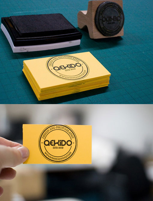
Other business cards created via a custom stamp:


I started looking into how to produce a stamp myself, as again I wanted to keep the outcome of the project low cost. In my search I found a material called Sugru. Sugru is a self setting rubber that can be manipulated by hand. The material and air dries and forms a strong bond with materials it comes into contact with for a long period of time. A packet of sugru, 12 small pieces would be enough to create 3 business card sized stamps. and at only £12 for the pack it was a great cost effective solution.


Here is a stamp that someone has created using Sugru. It shows that detailed stamps can be created with the material, and that when made with care, the outcomes are very clean and neat, much like a stamp that you would purchase in a store. This person has created the stamp by producing a mould out of rubber, inversing the design, so that when the sugru is pressed into the rubber mould it is facing the right way. 


Therefore I thought that I could produce stamps by pressing Sugru into laser cut plates made of wood. I could laser cut these easily in the facilities at college, again keeping the project low cost. All I would have to do is create 3 laser cut plates, and from the wasted wood create wood block handles as seen in the image above. 


The three stamps/ layers I would produce are shown below:


Cable knit background. 


Logo motif and products.


Back of business card.

I took what I had done so far to one of the crits. 

In the crit people questioned how I would be able to produce such detailed stamps as college does not have the facilities to do so. The laser cutter at the college is not able to cut such fine detail as I wanted for the cards. Such as the small type on the front and back of the plates without snapping the plate, or burning through sections. Therefore I found that making such detailed stamps would not be possible, and for now I have had to digitally print the business cards for the client. The client however will not be distributing her stock until August and so this gives me time to research an alternate approach to stamp making once my work load has died down at the end of may. I look forward to trying to find an approach that will be possible as I feel that this method of production goes beyond all others for the client, giving and even more hand crafted, organic aesthetic to the brand, as well as being 100%  cost effective for the clients lower budget.
The client was very understanding about the situation as I made it clear I would work on stamp relief printing much before her distribution time. Digital printing the business cards was also a cheaper option and was something If necessary the client could do from home if necessary.  


Friday, 7 March 2014

OUGD503 RESPONSIVE: Studio Brief 1 / Susan Clarke logo & business card.

SUE CLARK LOGO & BUSINESS CARDS.

I was approached by a client who was looking for some branding and a business card design for a new hobby turned business they were launching. When speaking with the client for the first time, I was informed that the project would be for a hand made jewellery and knitwear project, which she would be selling at various craft stalls, in further, applying into current boutiques and shops. I was given details of where to find some images of pieces that she had created so that I could begin to get a feel for the company. We arranged to meet up  later to have a discussion about where we could go with any of the design, and any initial ideas that I may have had in between.


I started to look into organic branding as I really wanted to emphasise the hand craft of the company. When doing this I noticed that a lot of designers had tried to mimic natural textures of nature, printing onto grainy card, mostly brown, and introducing others such as wood, as well as using a pallet of colour inspired by natures very own paintbrush. 


Uses a natural textures such as a heavily grained wood (used for the lid) and rope (used to attach tag). The branding also takes advantage of a hand rendered typeface to further enhance the being of an all natural identity. Colours used are black, off white and green paired with the natural textures. 


These business cards are about as hand made as anyone could produce. The cards have been create for a boutique booth in an antiques shop. The designer has combined a number of elements to create such a home made driven design. The designer has created a mix of hand drawn type and crafted paper, with the final pieces being printed via stamps. Creating designs that can be printed at home by the client is a great way to adhere to a low budget. Something I am having to do for my client. 


These business cards have been produced for a company which sells and distributes organic and eco friendly beauty products. The front of the cards appear truly natural allowing the materials do do the talking, rather than blurring this by adding colours or inks. The designer has made use of embossing, the most eco friendly process that can be used for mark making. This also means due to the lack of inks etc, that this process would also be very eco friendly. However any people, including my client would not have a embossing press readily available for them to use, and therefore this could produce extra cost.


I also wanted to look at a couple of designs which incorporated the craft that is the core of Sue's business, sewing/knitting. The above design has linked the use of a brown craft stock to the aesthetic of sewing. Although this is probably done for large run on machines, the design still gives the connotation of traditional sewing. The play on words of 'sew woodsy' also says that the business is approachable and friendly, this is reflected in the crafty, humble and down to earth design. 


The sewing technique has also been used in this embossed white business card. However here it seems to have taken on some kind of perforated affect in which the contact details can be moved from the card. Or, it has been used as a segregation line to determine the hierarchy of the business card layout. It is good to find an appropriate, yet fun and unique way of presenting information on embossed/debossed business cards as more often than not they can only be printed one-sided due to the displacement of paper. This is something to remember If It is a process I decided to use. 


I looked at a couple of card designs specifically orientated around or designed for knitwear designers. The above one is my favourite I have sound of the two as is its effective yet simple. It uses both a geometric cable knit vector patter and negative space to produce something straight forward yet compelling. The use of the knitwear pattern is a simple representation of the clients profession. The motif of a heart is used to represent the care that the client has for everything which they produce, much like the saying made with love. Negative space is a focus on the reverse side of the card with a small hint to the knitwear pattern, to ensure the front of the card grabs peoples attention, whilst the back focuses on informing them.


Again cool geometric shapes have been used to make this business card plain yet effective. However I do feel that the designer of this particular piece has been quite lazy with the concept. If the small illustration was taken away, as well as the text which elaborated on the profession, the business card could be for anyone. Therefore it is important to remember to create a personalised and bespoke response for every client. 


I found this business card particularly thoughtful and well considered, truly reflecting the meaning of an eco friendly business card. The business card has been printed onto brown pulp kraft paper, meaning that that the paper is made from recycled paper which has been through a chemical process to remove all ink, left behind is a raw pulp which can then be used to re-make paper.The ink printing has been done via soy and vegetable based inks on a commercial press meaning they are very environmentally friendly, and much kinder to the atmosphere than the opposing petroleum based inks.